Hey folks,
Summer is finally upon us (well, here in Massachusetts, it’s been a complete rollercoaster! 🎢) and everything seems to slow down. But May and June have been another combo of intense activity for the newsletter. I published a few solid posts (one went viral!), recorded a podcast, and promoted my webinar and upcoming course. Let’s review each in order.
Webinars and courses
A new cohort of my Rhetorical Data Visualization course is starting in mid-July. You can still sign up for it if you’re interested! You’ll learn how to detect and avoid misleading visualizations and design more truthful solutions. See details in my post.
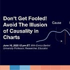
I published two live webinars, and I'm quite happy with them. The first is about ways in which visualization can mislead, beyond the classic misleading visualizations with which we are all familiar. The second is about a narrower but important topic: how we perceive causality from certain types of charts and why we can get fooled by them.
Watch the recordings!
Watch the recordings by following these two links:
If you have ideas for future webinars that you would like me to produce, please share them by sending me a message.
Posts and podcasts
My post on the “Illusion of Causality in Charts” went viral. It’s one of the most successful posts I've ever published. If you have not seen it, I encourage you to take a look.
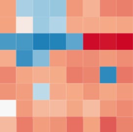
I also wrote about qualitative visualization. In May, I gave a private workshop, and I was asked to include information about qualitative visualization, which made me realize how foggy this specific area of data visualization is. The post includes initial ideas to define what qualitative data visualization is.
A few days ago, I posted something on “truthfulness” in visualization. Inspired by the webinars and my courses, I began exploring the concept of what it means for a chart to be considered “true.” You can expect more posts in the future exploring this important question.
Early in May, I interviewed Richard Brath to talk about the use of AI in visualization. Richard gives amazing demos of his experiments with AI. If you have not watched it yet, I strongly encourage you to take a look! On a side note, I plan to be more consistent with these video podcasts. There are a few more people I’d like to interview in the area of AI and visualization.
As a side note, you can also listen to the interviews on Spotify if you want to be mobile! You can find this interview here:
Future plans
InfoVis course online. I devoted the first six months of 2025, in large part, to producing educational material for my readers. There is a lot more brewing! Early this year, I began re-recording the Information Visualization course, but I was unable to finalize it. Luckily, there is very little additional work to do, so I will use the summer to finalize it and make it available.
Video podcasts. I’d like to make the podcasts more frequent. My idea is to create thematic podcasts to cover a whole topic in depth. I started with AI, and I’d like to finalize it before moving on to something else.
Post series. I have lost traction on my series. I should definitely get back to producing series and then use them to build more permanent material. I was not able to finalize the one on Vis for ML because there is way too much new material to review. The good news is that in the fall, I will teach a seminar course at Northeastern University on Visualization and GenAI, and I am sure this will enable me to write more posts for the series.
And you?
I hope you are having a great summer! There are many news readers here. If you'd like to introduce yourself and share your interests, I’d be delighted to learn more about you. Feel free to send me a message with specific comments or requests.
Thanks for reading! 🙏
Enrico.


