


When Is a Chart “True?” What Does It Even Mean?
Mulling over the meaning of truthfulness in charts

It’s funny how there is an extended literature in the many ways a chart can lie, but somehow very little about what it means for a chart to be “true.” You may think that a true chart is one that does not lie, but as you will see in a moment, it’s not as simple as it seems.
I have been mulling over this question for a while, when writing posts on misleading visualizations here and while developing my Rhetorical Data Visualization course.
What does it mean for a chart to be true? I can’t say I have a definite answer, but I think I have a few ideas that can help us make some progress in having a better understanding of truthfulness in visualization.
Charts and “data facts”
The first thing to notice is that charts are not inherently true or false. What is true or false is the information an individual extracts from a chart that can be true or false. I like to call this information “data facts” because they are statements that one extracts, implicitly or explicitly, from the data through the use of charts. Think about it, starting from the same chart, different people can come to different conclusions, and some of these conclusions can be closer to reality than others (and some can be simply wrong).
A classic example I use in my courses is this map that shows the number of vehicle collisions in New York City.
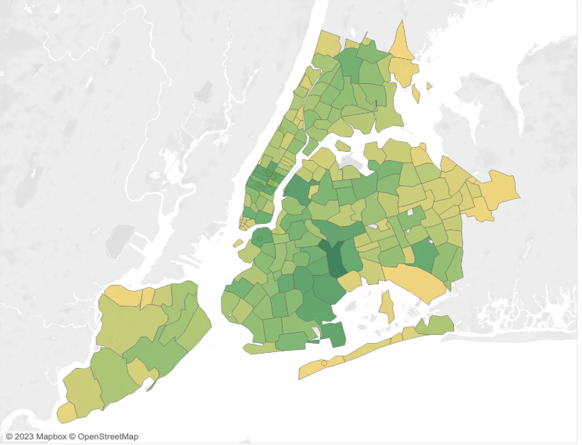
When examining this chart, I may conclude that the darker areas are more dangerous ones, but I would commit a logical error. High-value areas simply have a higher density of cars, which does not necessarily mean they are more dangerous.
So, when we consider the truthfulness of a chart, we must shift our attention from the chart itself and focus more on the facts that individuals extract from it.
Where do “data facts” come from?
Data visualization is used in many different ways, but we can identify, for simplicity, two broad classes of situations:
Data analysis: You perform the analysis and are responsible for interpreting the charts.
Data communication: You read the result of somebody else’s charts and the contextualization developed by the author.
These two classes are not necessarily distinct, and we can identify hybrid cases that fall between them. However, the main distinction is whether the charts come somehow “predigested” with a series of data facts you are supposed to verify in the chart or not. Examples of elements that play a role in these cases include: chart titles, annotations, captions, surrounding text (if embedded in a text), speaker notes, and gestures (if part of a presentation).
This distinction is essential because a disconnect between data facts and reality can stem from a) your inability to extract true facts from data in analysis, b) the inability of the author to present true facts from data, and c) your inability to detect gaps between reality and the data facts produced by the chart’s author.
Whether you are an author, a reader, or both, the good news is that the skills you need to acquire are the same: you need to be able to assess potential gaps between data facts extracted from charts and reality. In other words, you have to learn how to assess their plausibility or their probability of being true.
But charts bias interpretation!
If charts are neither true nor false, why do we care about them so much then? We care because they play a significant role in guiding people to extract specific types of information from data. If you start from the same data and create different types of charts, you can induce people to extract different information.
Here is one of my favorite examples borrowed from my colleague Michael Correll.
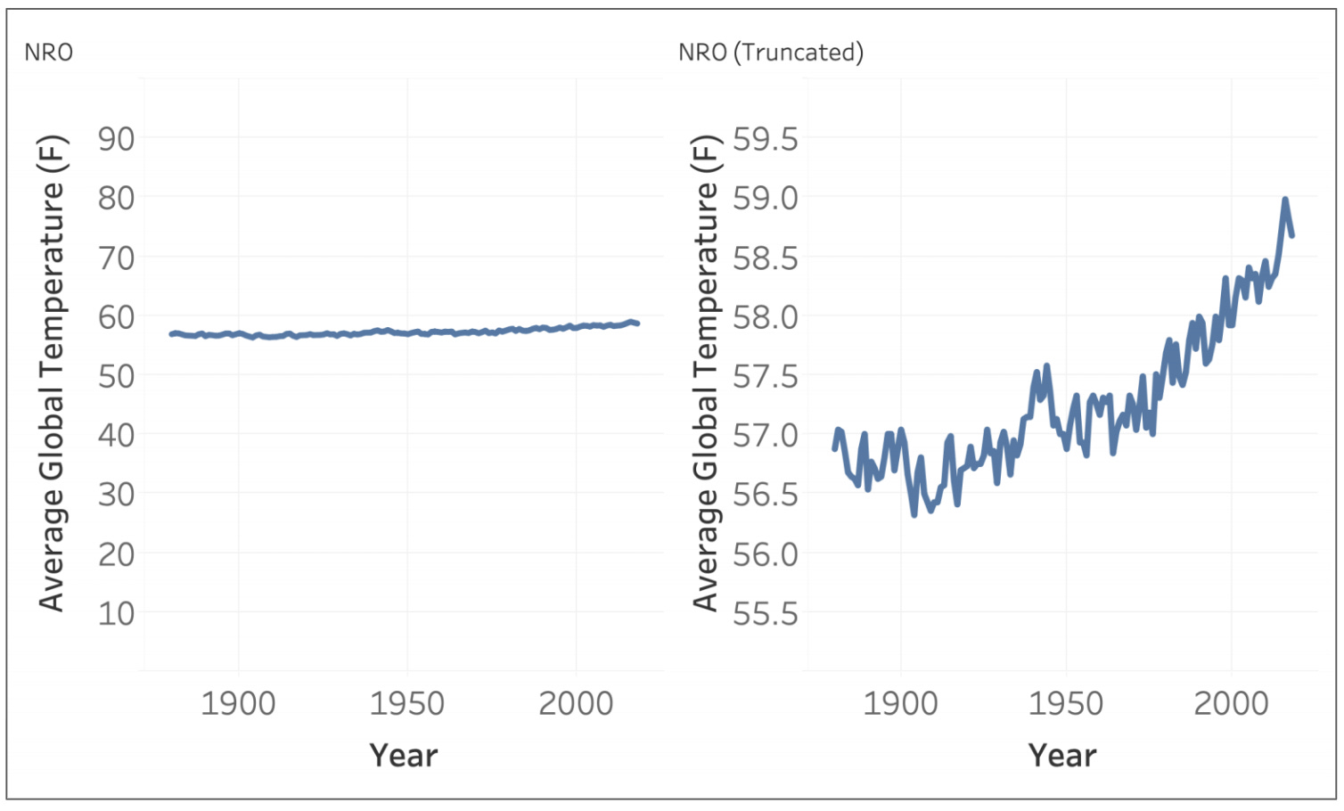
This is the same set of values representing global temperature. The only difference between them is the scaling used in the vertical axis. One leads the reader to conclude that the temperature has barely changed, while the other suggests that the temperature is increasing.
When considering how charts influence interpretation, we must avoid the mistake of believing that the bias derives exclusively from the graphical properties of the charts. In fact, multiple components play a role in the process that leads us to derive facts from data.
A good example is the cherry-picking problem that can be observed in charts.
There are at least four elements that play a role in inducing specific interpretations:
Data selection: The data objects and values we decide to include or exclude.
Data processing: The calculations and aggregations we decide to produce.
Data representation: The visual representations that we decide to use.
Data framing: The titles, annotations, textual descriptions, etc., that we decide to include.
All these elements constitute what we commonly refer to as a “chart.” In other words, a chart is the combination of all the choices mentioned above and all induce specific interpretations. In turn, these interpretations produce the data facts that can be closer or farther from the true (or, in some cases, simply untrue).
Agency and skills
Let’s recap the main ideas we have covered so far:
It’s the data facts we extract from them that can be true/untrue (or probabilistically more true/untrue)
Charts influence what data facts readers extract from them
Many elements that constitute a chart have an influence on the data facts that readers extract from it
These statements, however, do not cover a very important observation: different readers extract different information from the same chart.
Even though charts bias interpretation, this does not mean that all readers come to the same conclusions. People with diverse backgrounds, knowledge, attitudes, and skills often draw different conclusions when presented with the same graph, and some of these conclusions are more accurate than others.
Numerous studies have demonstrated this effect. Especially when charts display data on particularly sensitive topics, people’s attitudes play a significant role in the level of scrutiny they apply and the conclusions they draw. I had the privilege of conducting some of this research myself several years ago while studying the persuasive effect of charts. One of the major findings of that work was that the persuasiveness of a chart depends on initial attitude, and similar effects have been found in other follow-up studies.
The immediate consequence of this observation is that if you want to improve your data thinking skills and avoid data-reality gaps as much as you can, you need to improve your chart assessment skills and become a stronger critical data thinker. Becoming a better chart reader involves learning to consider all the elements I mentioned above: the data, the representation, the contextual factors, and, more significantly, your attitude and emotions.
Learn these skills with me!
Mastering these skills takes practice, but I can help. I have developed a whole course aimed at helping people upgrade their data thinking skills.
If you want to know more about the course, here are a few non-exclusive options:
📕 Check the syllabus of my Rhetorical Data Visualization course (scroll to the bottom).
📹 Watch the free webinars I recorded:
💬 Book a 15-min call with me. I’d be happy to give you a course demo!