Hi readers! 👋
I am happy to be back to giving updates after the Christmas break. I hope you all had a great break and a great start in January! My January has been intense but full of great activities. Here is a recap of what happened and immediate future plans.
Information Visualization Course at Northeastern
In early January, I started teaching my new PhD-level Information Visualization course at Northeastern, and it’s been a lot of fun. The students are super active and sharp, and our interactions have been lots of fun. I plan to report more about how my class is going soon.
Series on Data transformation for Visualization
The series on data transformation is coming along well! These are the 5 posts I have published so far:
The next one is almost done and will focus on “granularity.” Once the series is completed, I am contemplating collating the posts together into something more permanent. I am not sure what yet; maybe an ebook of some sort. If you have any suggestions, let me know in the comments below.
Video Lectures on Rhetorical Data Visualization
Last week, I published my second video lecture of the series on “Rhetorical Data Visualization.” You can find the videos in this Loom folder. Here are the individual videos:
Originally, I was hoping to post these lectures at the same time I was teaching my university course, but it turned out to be too much work all at once. I will keep publishing new video lectures here. Similarly to the series on data transformation, I plan to turn these videos into something more permanent once I am done, but it will take a little while. Some of you asked when these videos will be available as a full course, and the answer is that I don’t know yet. But my intent is to make it happen in a reasonable amount of time. Once the series is completed, I’d like to organize cohort courses based on them. If you are interested, please leave a comment below.
Panel on Visualization + AI
Last week, I participated as moderator of a panel I organized with my colleague Paolo Ciuccarelli at the Center for Design. The panel's title was “Where Does Data Fit in an AI-Driven World?” We had some great panelists working at the intersection of AI and Visualization. We had Michael Correll (Northeastern, Roux), Mennatallah El-Assady (ETH, Zurich), Hendrik Strobelt (IBM Research), Melanie Tory (Northeastern University, Roux). The panelists gave very thoughtful and fun 5-minute presentations, and then we had a long conversation and Q&As. It was great to see some mixed opinions and explore ideas about the role of visualization in the future. You can watch the entire event on YouTube here:
Illustrations
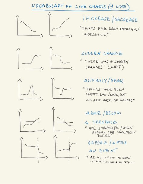
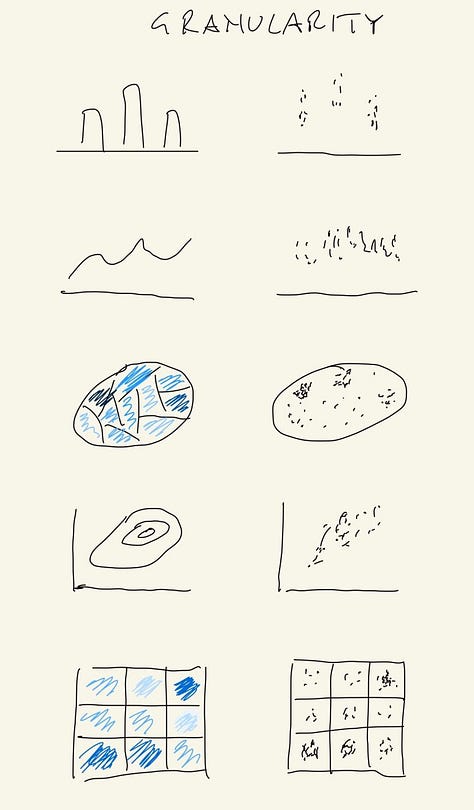
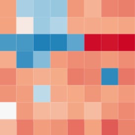
If you're on LinkedIn, you might have noticed that I post some (sometimes hand-drawn) illustrations there. I stumbled into this idea almost by chance, but these posts seem to resonate with people a lot. Here are the three illustrations I shared in the last few weeks/months.


Here are the individual posts:
It’s been fun and informative to produce these illustrations. They often come from quick intuitions and an urgency to share and hear what others have to say on the topic. Some of these ideas find space in posts I write here. For instance, the upcoming post on granularity will borrow elements from my illustration on granularity you see above.
Help me spread the word! 🙏
If you like what I am doing and want to support my work, please leave feedback and requests here and share this newsletter with your friends and colleagues. You can share a link to the newsletter using the button below. Thanks!


