


VisML#3: What Type of Machine Learning Data Is There To Visualize?
Where I describe where ML data come from and how they play a role in visualization

This is Post #3 of my series on Visualization for Machine Learning. If you want to know more about the series, start from the introductory post, which also includes links to the posts published in the series so far (this one included). If you are new to this newsletter and want to receive future updates, subscribe now to receive the updates directly in your inbox.
In my previous posts, I mentioned the idea of organizing the series around what data is available to visualize coming from ML models. In this post, I will provide a first overview of this organizing principle. My intent is to give you a better sense of what I have in mind without providing too many details yet. This little framework will help us place specific visualization ideas in a broader context. The framework includes three main sources of information derived from machine learning models.
Model input-output.
Model explanations.
Model components.
Let’s take a look at each one …
Model Input-Output
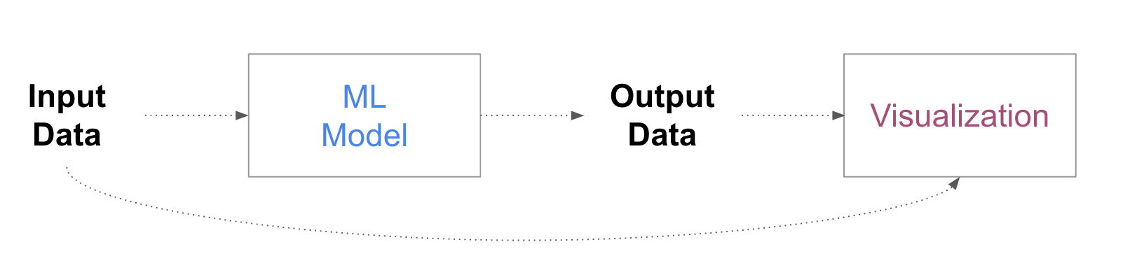
Since models generate some output for any given input, visualization can be used to depict data generated from the model and any derivation of these data. Since input and output are logically connected, visualizations can focus on these data to describe model behavior and make inferences about its logic. One can, for example, visualize how different characteristics of the data correlate to specific outputs and the number of errors the model produces. A common example is multidimensional projections, which form a sort of “map” or “landscape” of the data space and can help generate glimpses of how the model behaves in different “regions” of the data space (we will explore these and other techniques in way more detail in a future post).

The image above shows an example from the “embedding projector” tool developed by Google and available within Tensorflow.
Model explanations
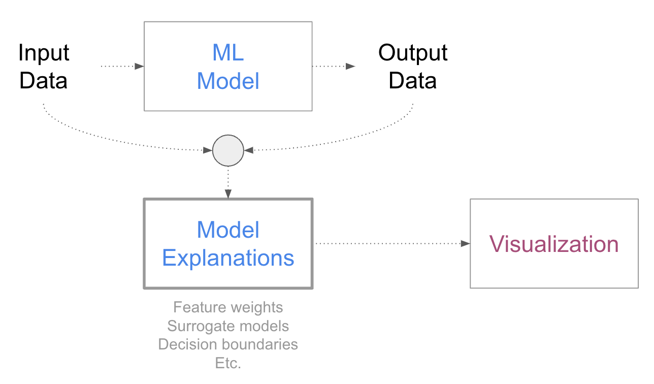
Model explanations are ML methods that help people gain a better understanding of the model’s logic. I will explain these methods and their various intents and applications in more detail in a future post when we will cover data visualizations based on explanations. For now, one way to think about them is that they are a sort of “models of models” and that they help with extracting information from models that is hard to draw exclusively from looking at the input-output behavior. Very often these methods try to estimate the importance of different data attributes or features, but they are not limited to that goal. Visualization can be used to explain specific data instances or entire groups of data. A good example we will examine in more depth in future posts is the technique called SHAP and its associated visualizations, which provide information about the weight a model gives to the features it uses.

This is an example coming from the SHAP library showing the importance of each feature for each individual data point in the data set.
Model components

Finally, one also wants to look inside models to understand how they work and what role individual components play. For traditional models with a somewhat intelligible structure, visualizing model structure and components comes naturally and exposes some of the internal logic directly. For more complex models, like those based on deep learning, visualizing the behavior of individual components or parts of the architecture can help understand their role in producing complex tasks. In language models, for example, it is common to visualize the “attention” mechanism, which represents which of the preceding words the model uses the most to predict the next token.

The image above, coming from the Bertviz tool, provides a common example of visualizations of the “attention mechanism,” which permits us to understand which, among the preceding words, the models use the most to make the next word prediction.
So, summarizing, once a model has been trained we can identify the following elements. Data comes into a model as an input and produces some output. The data produced from the model, as well as the model itself, can be used to generate model explanations. If you look inside the model, you can find various components, a bit like the engine of a car or a plane. For this reason, we also consider model components and the information they receive or produce. That’s the material we work with when we visualize machine learning1!
In practice, this subdivision may not be as neat as what I presented here. For example, one could have methods that integrate or relate model explanations with model structure or model data with model explanations. But as a first approximation, these three categories help us organize the existing work in a useful logical structure.
One additional observation is that these three types of data correspond to the three types of focus I outlined in my previous post, which are understanding model behavior, logic, and mechanics.
Data types
In the description above, I did not consider what type of data a model handles, which typically corresponds to what type of data has been used to train it. These are some of the most common data types:
Tabular: Think spreadsheet. A data set is made of rows and columns, where the rows represent some objects of interest and the columns have some attributes that describe properties of these objects.
Temporal: This is often a tabular data set with temporal information added. That is, it is a data set where the values are anchored to and depend on specific times.
Spatial: Data with a spatial nature. Very often spatial data sets are geographical data sets, but they can also describe different types of space. Similarly to temporal data sets, the information here is anchored to locations or regions. (Spatio-temporal is also an interesting case: data sets that describe spatial phenomena that change over time (e.g., weather, urban mobility, animal migrations).
Multimedia: This is any data set based on images, audio, video, or a combination of them. Multimedia data sets are very different from the data types mentioned above because they do not have an intelligible tabular structure.
Language: This is data made of text and whole sentences. This is also a type of data that is not amenable to tabular structures, is characterized by linguistic components, and often requires special transformations before being handled by a model.
Networks: This is data characterized by relational structure, which can often be described as a series of nodes and connections between the nodes. Social networks are an example of this type of data; people are connected by friendship.
Recognizing data types is important because most visualization techniques can handle only specific data types. For example, maps work for geographical data, statistical plots work for tabular data, and link-node diagrams work for network data. By knowing what type of data a model handles we can narrow down the set of visualizations that will work for that type of data.
In terms of output, most traditional models produce two types of outcomes: labels or quantities. Classifiers produce categorical labels, like when classifying transactions as frauds or what type of object is in an image. Regressors produce quantities, like when predicting the time it will take for a rideshare car to arrive.
Models can produce a wide variety of other outputs, including rankings and groupings, as well as complex objects like full images, text, etc. Importantly, these outputs are most often associated with performance metrics that derive from ground truth information from training and test data. For this reason, visualizations also handle performance data derived from these metrics, often in terms of error quantification.
As I explained earlier, the data part of data visualization is not limited to a model's input and output but also includes ML explanations and data coming from internal components. Characterizing this type of data is crucial, and more work is needed to better understand this aspect of data visualization for ML. Most of the design work visualization designers need to do in this space is to understand what type of information can be extracted from models and how such information helps answer important questions we have about machine learning models.
Data phase
Machine learning is not only about model development but also about assessing and monitoring what a model does after deployment. While the type of information extracted from models may look the same between these two phases, models in production can produce additional information that models in development do not have. For example, models can experience data-shifting problems as well as edge cases that are simply not visible when a model is being developed. For this reason, visualization can also be used as a monitoring and assessment tool to understand how a model behaves once it has been deployed.
Another important situation to consider is when a model is used by a person to support a human-driven task. For example, in health care and banking, it is increasingly common to find ML models that support decision-making. For these cases, visualization can also play a major role by making the output of the model and its uncertainty more intelligible and helping the decision-makers integrate the output of the models in their decision-making process (e.g., to understand when it makes sense to follow a model’s recommendations and when not).
Data granularity
Another distinction I’d like to make regarding “what to visualize” is about the granularity of information. In explainable AI, researchers often make a distinction between local and global explanations, that is, methods that provide information about single instances (e.g., how did my model make this single specific prediction?) versus methods that aim at giving an understanding of the entire model (e.g., what are the most important features in this model?). In visualization, we can do the same, except that we can add an intermediary step focusing on subgroups, groups of instances grouped according to some criteria like sharing a specific attribute (e.g., all instances that are false positives, false negatives, true positives, and true negatives). In summary, visualization can handle data at three different levels of granularity: individual instances, subgroups, and entire data sets. How to create subgroups is part of the data design process I already mentioned above. Different ways to aggregate data into subgroups can lead to different visualizations and can enable people to answer different types of questions.
Data from multiple models
One last element I’d like to cover is comparison. I have already mentioned how relevant comparison is for model understanding. This means that when we build visualization tools we need to consider if we want to support model comparison as a task. Many techniques developed for model visualization work only for individual models and it’s not immediately evident whether and how they can scale to comparison of two or even multiple models. In fact, when I look into the literature of data visualization for ML I can’t find too many solutions that work for model comparison. This is surprising given the relevance of this task and my hope is that we will see new methods developed in this space soon.
Conclusion
This post gave you an overview of what is possible to visualize in machine learning, or in other words, where the data comes from. As we focus more on the data side of data visualization, it is important to emphasize two aspects that are too often overlooked. First, different data sets allow us to ask different types of questions and ultimately produce different types of knowledge. Making this association between data, questions, and knowledge is essential to avoid visualizing data without a particular aim. Second, data extraction and transformation are part of the visualization process, so deciding what data to extract from the model and how to transform it before it is visualized is at least as essential (if not more essential) than deciding what visual presentation to use. This post forms the basis for many of the upcoming posts, which will go much deeper into the data sources I have outlined above.
Previous posts of the series
If you missed the previous posts of the series, you should definitely take a look!


Reader’s feedback
This is a long-term project. These posts are initial drafts for something more structured I’d like to build once the series is done. It may be a book, a course, or something else. If you like what I am writing please let me know how this is useful to you and how I could be of more help also! If there is anything specific you’d like me to cover, I’d be happy to hear it. Just leave a comment below.
Also, if you know someone who might be interested in this series, can you please send them a link to the newsletter? The more people we have here, the richer the conversation is going to become for everybody. Thanks!
In reality, it is always possible to add more visualizable elements, but this should cover most of the information we are interested in.
I have read post three times over and keep finding nuggets of information that inspire me"...Most of the design work visualization designers need to do in this space is to understand what type of information can be extracted from models and how such information helps answer important questions we have about machine learning models..." Like how to make the model visualization intelligenible so that the individual using the model can better understand uncertainty to looking through local , subgroups and global to really understand how the model is working... It's like zooming in to see the leafs on the tree, then see the tree itself to the whole forest. I really like this problem and just has me wondering how I can apply this in both my hobbies and professional life. Can't wait to see what comes next. Thank you!!!