
Data Visualization Titles: A Taxonomy
An initial taxonomy on the type of titles you can use

After covering the science behind titles, it’s time to get more practical and see what we can do to generate titles more systematically. You are developing a new communicative piece with data visualizations and have to decide what kind of titles to use. How do you decide what to write? Most people just write something casually, but as we have seen, titles matter a lot, so I’d say the first rule of titles should be to “be mindful of titles.”
If you are more mindful, you’ll start asking yourself what the best titles for your specific context are, and this is already a big improvement.
A useful tool to help you make a decision is to have some sort of taxonomy of titles so that you know what the design space is. A taxonomy provides a way to think about titles systematically so that you can choose between options rather than start from scratch every single time.
Unfortunately, there is no established taxonomy of titles, so we will have to rely on my intuition and a few readings I have done on the topic. While preparing for a class on titles I developed a few weeks ago, I read a few papers and blog posts to hopefully find something like the taxonomy I had in mind, but I could not find anything that felt right or complete. I have to mention one specific resource that was helpful in shaping my thinking about titles: “Accessible Visualization via Natural Language Descriptions: A Four-Level Model of Semantic Content” by Lundgard and Satyanarayan. Interestingly, this paper is about captions and ways to generate captions automatically, but the characterization they provide helped me think more systematically about titles. In the end, the line between titles and captions is very thin, so it’s understandable that research work on captions can inform us about titles and vice versa.
So, after all this thinking, I came up with this. Titles can be categorized into three broad classes: declarative, interpretive, and extrapolative.
Declarative Titles
Declarative titles focus on declaring what type of information is depicted in a chart. Their goal is to help you figure out how to read the chart and provide (or reinforce) the semantic connection between the graphical elements of a chart and their meaning. In this sense, titles work hand-in-hand with legends and axis labels, which often are the main “semantic hooks” we use to make sense of what a visualization depicts. Titles reinforce this information and make it more directly accessible to the reader. In the example below, the title makes it immediately clear what this chart is about.

Declarative titles are the most often used type of title. People default to this type of title and it’s the one everyone feels is more “neutral.” Some declarative titles are better than others, and starting from the same charts, many different types of declarative titles can be created. If you think about it, declarative titles could include a wide variety of combinations. Since visualization can be a combination of multiple variables, data aggregations, and data filtering choices, all combinations of these elements are good candidates for inclusion in titles. Of course, one often can’t possibly include everything, so as a designer, one has to choose what to include and what to exclude. My cursory exploration of title practice convinced me that in the majority of cases, chart titles only mention the main quantity depicted and (maybe) another independent variable. So, for example, with a simple line chart, you’ll get something like the charts depicted below.

But what if you have something more complex, like this chart below?
Interpretive Titles
The second option is to use titles that guide the reader in the interpretation of the trends, relationships, and patterns depicted in the chart. These titles focus less on the description of the chat structure and more on the content. Let’s reuse one of the charts above to compare declarative and interpretive titles.
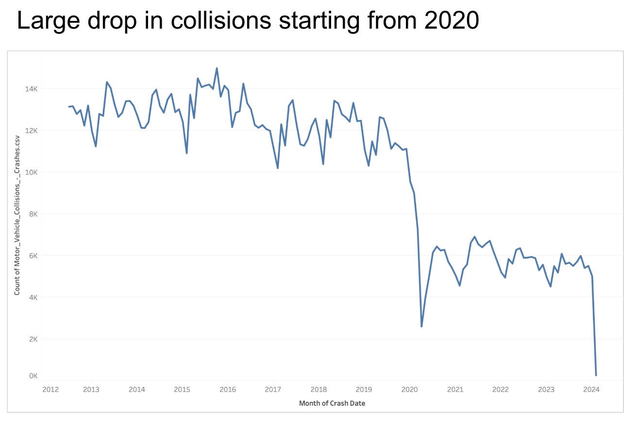
As you can see, the interpretive title tells readers what information they are supposed to extract from the chart. Here again, we have multiple options. Not all interpretive titles are equal. One broad distinction is between titles that describe patterns in a domain-agnostic or domain-specific way. It’s easier to illustrate the difference with an example. For the map below, one could use two different titles, either “Areas with high volumes” (domain-agnostic) or “Some Brooklyn zip codes have a concerningly high number of collisions” (domain-specific).

An interesting problem arises if there are multiple “data facts” one can extract from a chart. Take the chart below as an example.

Looking at these charts, we can extract multiple pieces of information. We can focus on the fact that “driver inattention” is the leading cause of collisions, that unsafe speed generated the highest number of people killed, or on the contrast between these two facts. Titles put a spotlight on the chart, and the more complex a chart is, the more difficult it is to decide what to put in a title.
Extrapolative Titles
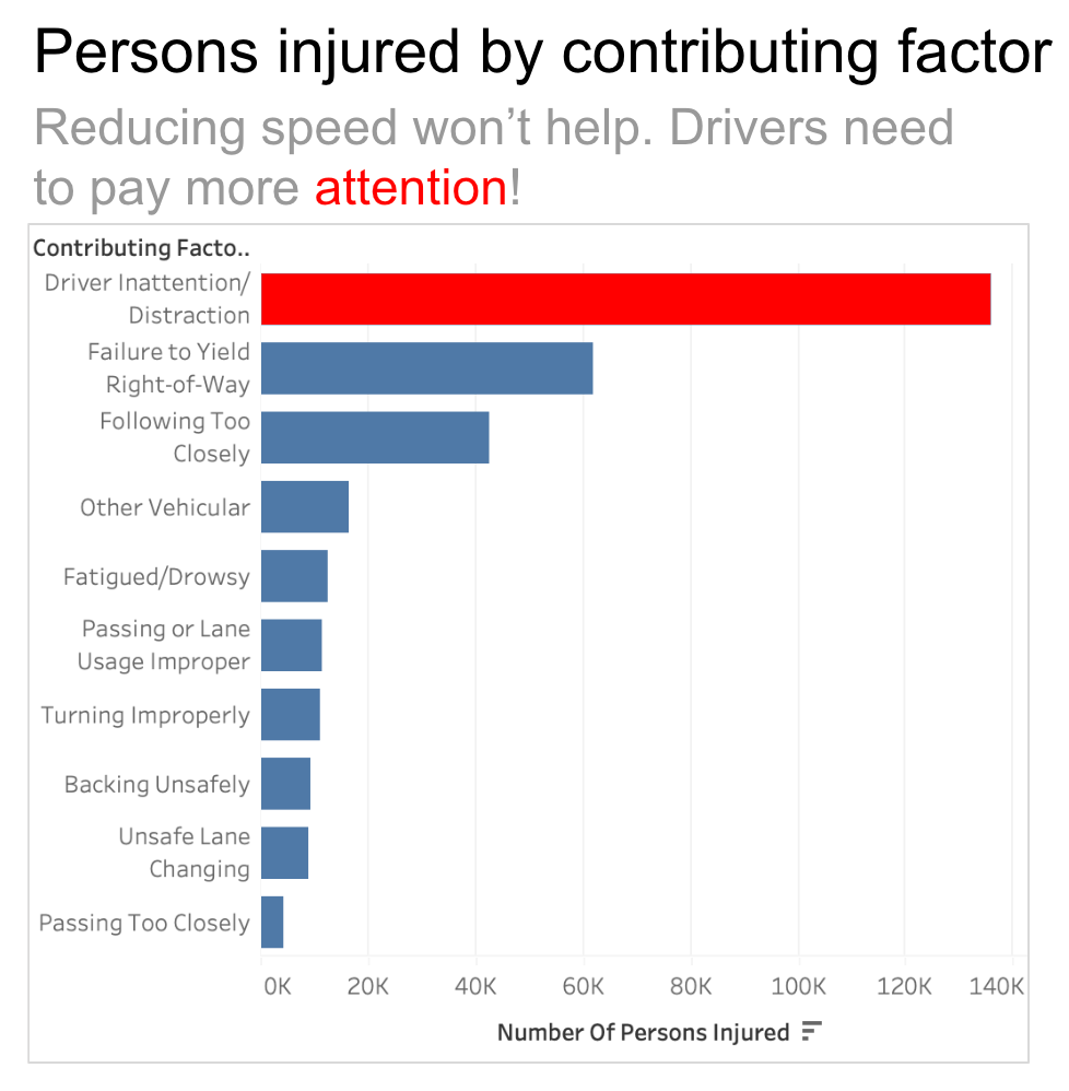
The last type of title is extrapolative. These are titles that contain an extrapolation of the data and patterns depicted and include knowledge and inferences that require information that is not present in the visualization. Typically, these titles include background knowledge and inferences such as something that works or does not work or consequences of the patterns observed in the data. Here again, an example will make the idea much clearer.

This title has the two key components mentioned above: it mentions “reducing speed” as an intervention (background knowledge) and provides a recommendation based on the fact that distraction plays such a major role in collisions.
Question Titles
I don’t know if this is a separate class, but another type of title I like a lot is questions. Sometimes, questions can be used as titles for data visualizations that work as an answer. Continuing with the same chart used above, one potential question title could be this.

One of the best examples of this type of title is the Bloomberg climate models piece I mentioned in a previous post.
I like question titles because I am a big fan of conceptualizing visualizations as tools to answer questions. In fact, this is the way I like to teach my visualization courses: I encourage my students to declare explicitly what questions they want to answer with the visualizations they develop.
Title Combinations
The title types outlined above can be combined to find a synergy between their different strengths. Titles can be combined with subtitles effectively, giving readers multiple entry points to absorb the information. One particularly powerful combination is the use of declarative and interpretive titles together.

The declarative part helps get a sense of what kind of data is depicted, and the interpretive part of what particular information is worth extracting from it. Similarly, one can pair up declarative and extrapolative titles or question and declarative titles. All combinations are possible and can be used as basic tools for more creative solutions.
Titles and annotations
So far, I have not covered the relationship between titles and annotations. When we talk about the narrative layer around a visualization, titles, and annotations, play a synergistic role. So much so that I think titles and annotations should be covered together when teaching data visualization. I will write more about annotations and the way they relate to titles. Here, I want to provide an example and flag the issue that no discussion about titles is complete if we don’t cover annotations. Here is a version of one of the charts used above where titles and annotations play a synergistic role.
Color creates a link between the title’s content and the chart element that needs to grab your attention to fully understand the message. There is way more to say about annotations and the interplay between annotations and titles. For now, it is sufficient to demonstrate that a very powerful link between the two exists.
Conclusion
I hope this little categorization can help you think more productively and systematically about titles. I am curious to hear what your experience with titles is. How do you create titles? Does this little model make sense to you? Do you think it can help you build better titles in the future? Let me know by leaving a comment below.
Also, as usual, if you like this post, please help me spread the word by sharing it on your favorite social media channels or just sending it to your friends and colleagues who might be interested. Thanks!
Thank you for this insightful article! As a dashboard designer, I often struggle with applying principles of title design to dynamic or interactive visualisations. Unlike static visualisations, dashboards evolve based on user inputs, such as filters, time ranges, or drill-downs. This makes it challenging to craft titles that remain clear and meaningful across different contexts.
I’d love to hear your thoughts on designing titles for interactive contexts and how we can apply these principles to guide users effectively. Thank you again for sharing your framework—it’s already helped me think more systematically about my title design process!
In my opinion, repeating the names of the axes is not enough for the title of the graph. Also, every graph must include the measurement dates. I teach my students that there are 2 types of titles: conclusion and description and their combination.
A conclusion title is like an interpretation title in your taxonomy. "The reason for the largest number of road accidents is..."
A description title must include one of the 5 types of meanings that can be identified in the format (structure) of the graph: hierarchy, seriality, dominance, trend, density. For example:
"Hierarchy of the number of road accidents by causes in 2020."
Ordinality of the number of road accidents by months in 2020."
"Trend in the number of road accidents by years from 2018 to 2020."
"Dominance of the percentage of the cause... in the total number of road accidents in 2020."
"Density of the number of traffic accidents per 1000 residents in the area... in 2020."