Shape the Data, Shape the Thinking #4: Granularity and Visual Patterns
Exploring the impact different levels of granularity have on visual representation and the different patterns that can emerge
(This is the fourth post of the series on data transformation in visualization. To get access to the previous posts of the series, check the links at the bottom of the page.)
An important property of some information is that it can be organized into hierarchies. Time, for example, is hierarchical (days, weeks, months, etc.) Geographical locations are hierarchical (zip codes, neighborhoods, towns and cities, states, etc.) Organizations are hierarchical (offices, units, divisions). Many things are hierarchical. A relevant consequence of the hierarchical organization of information is that hierarchies allow the presentation of information at different levels of granularity.
You might ask, “What does this have to do with data transformation?” A lot. Even if a data set comes without a hierarchical structure, hierarchies can often be built out of the existing attributes through data transformations. Also, even when hierarchical structures are already in place, one has to decide which level of granularity is the most appropriate for a given problem. Different levels of granularity often reveal different types of information, so it’s really important to look at this problem in a principled way.
Granularity by data type
The first step is to get a sense of how different data types can be organized into different levels of granularity.
Time is inherently hierarchical. Seconds can be grouped into minutes, which can be grouped into hours, etc.
Space is hierarchical because it’s always possible to group locations into regions and regions into higher-level groupings.
Quantities are hierarchical because it’s always possible to group quantities into discrete bins at increasing levels of granularity.
Categories are hierarchical because it’s always possible to group categories into groups and groups into larger groups, etc.
The fact that each attribute type can be organized into a hierarchy means that they can be used to visualize information at different levels of detail. Since many visualizations result from calculating summary statistics over groups of values, in hierarchical organizations of data, it’s always possible to calculate statistics at different levels of granularity.
Let’s explore one example for each data type using the NYC vehicle collision data set to make this idea more concrete.
If I want to explore how collisions distribute geographically I can decide to look at this information at the level of zip codes or boroughs.


If I want to explore how collisions change over time, I can analyze them at the level of days, weeks, or months.


If I want to see the distribution of the number of people injured in a collision, I can organize it using a granularity of one, two, or three collisions (note: I had to cut the graphs a little to make them fit in the gallery below).


If I want to visualize how many collisions there are with different collision contributing factors, I can use the actual factors recorded in the data or group them into a few classes (note: here, too, I had to cut the plots to make them fit in the gallery below).

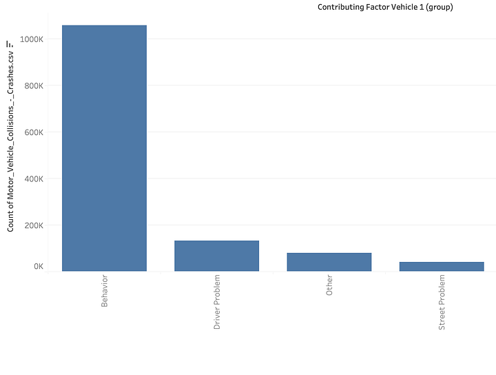
As you can see granularity is everywhere in visualization! With any attribute type (geographical, temporal, quantitative, categorical), it is always possible to work with different levels of granularity.
Individual units vs. aggregations
The examples above cover only the level of aggregation afforded by different data types, but another relevant type of granularity transformation happens when, in a visualization, we shift from individual data points to aggregations that result from aggregating those individual data points. Examples here will make this concept much clearer than words.
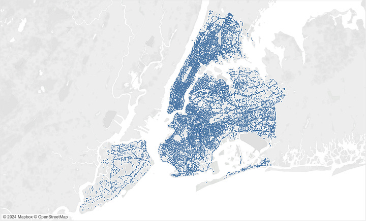
If I want to visualize how the collisions distribute spatially, I can use individual data points, like in the figure below on the left, or I can aggregate this information at the level of zip codes and map the frequency of collisions to symbol size.

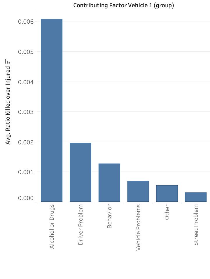
Similarly, if I want to analyze the severity of collisions (using the ratio of people killed over people injured) by contributing factors, I can generate a bar chart like the one on the left or a strip plot like the one on the right.
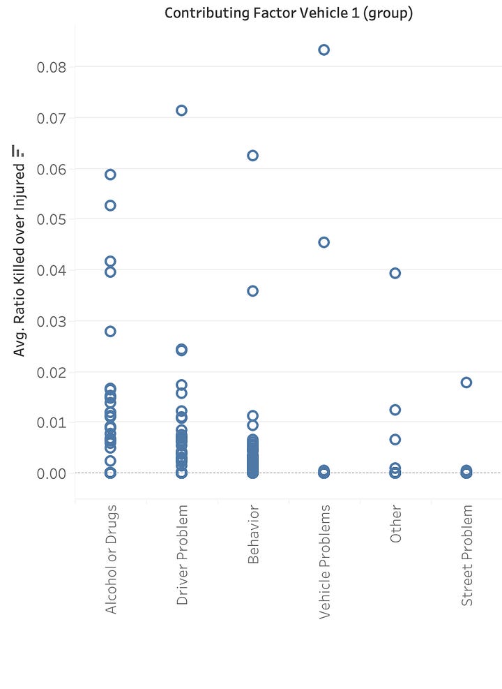
Individual data points can always be aggregated into higher-level abstractions, each giving access to different types of information. A common pattern is to go from individual data points to density to some kind of model. Scatter plots, for example, follow this pattern: you can map individual dots, a density layer, and a regression line. Similarly, you can go from a strip plot to a histogram to a box plot. Etc.
Lower or higher granularity?
As you can see, every change in granularity often leads to a remarkable change in the visual information communicated by the visualization. It’s easy to see that different granularities make different trends apparent. So, the natural question is, “What is the ‘right’ granularity for a given problem?” Visualization, as a field, has always pushed for higher granularity. The rationale is that aggregations hide details, and hiding details may lead to incorrect data interpretations and missing useful information. The hallmark of this idea is Anscombe’s Quartet, which is often used as a motivation for the value of visualization. The quartet refers to four manually created data sets that have many summary statistics in common (mean of x, mean of y, regression line, etc.) and yet look completely different when visualized in a scatter plot.
However, I do not think that higher granularity is necessarily always better. The reality is that different levels of granularity often bring different patterns to the surface, making signals more or less salient. While lower granularity can hide information, higher granularity can dampen useful signals into noise.
Take a look at the two examples above, where I compare visualizations with individual data points to those with aggregated data. Look at them carefully and try to think what information you see in one that you can’t find in the other.
The two maps, for example, are good at surfacing different types of information. The more granular one on the left makes what happens on individual roads much more apparent. The one on the right is much better at showing where collisions concentrate. The bar chart and the strip plot are also complementary. The bar charts communicate the mean much better, but the strip plot gives a sense of the distribution inside each category.
Lisa Charlotte Muth has an excellent post from Datawrapper showing how different levels of granularity in choropleth maps can surface different types of information. Here are a few images I took from the post (do read the post - it’s great!), to give you a sense of what you can see.


What is revealing is that different levels of granularity show different patterns and trends, and all trends are, in principle, potentially useful.
I feel that how signals emerge from different levels of granularity is a somewhat under-researched aspect of data visualization. What I know personally is that I always explore different levels of granularity when I work with data, and often, it takes quite a bit of tinkering to let a signal emerge. Not only one needs to see what emerges from different levels of granularity but also one needs to make sure they are not fooling themselves. Visualizations often produce “spurious visual signals,” that is, things that emerge from the visualization but don’t have any real-world significance (a good topic for an additional post).
In summary, when we talk about choosing levels of granularity, the same rule we have seen in previous posts applies here: there is no fixed rule. When working with data, you always have to experiment and use your judgment. There is simply no way around it.
Hybrid solutions
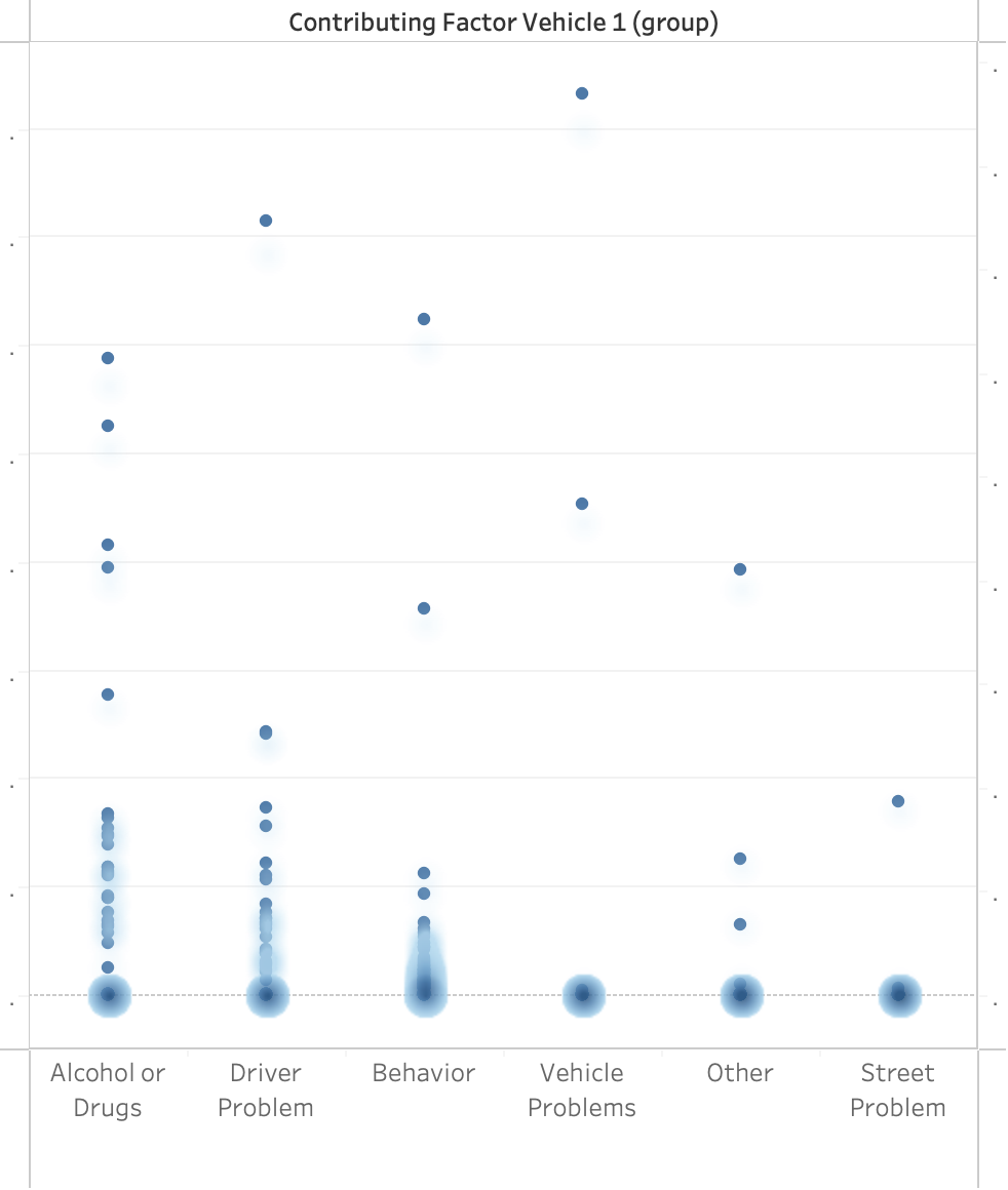
So far, I described the problem as if the only option is to use one specific level of granularity, but in reality, it is also possible to use hybrid solutions. A hybrid solution is a visualization technique that integrates information at different levels of granularity in the same visualization. All the visualizations I described above, where I compared individual data points to aggregated versions, can, in principle, be integrated through layering. Layering means arranging different pieces of information on top of each other. Here is an example using one of the plots above, where I layered the individual data points and a density plot that shows the density of the dots.
Layering is hard because it can quickly lead to clutter and confusion, but when done correctly, it can be very powerful!
Conclusion
As with many other data transformation steps we explored in the series, there is no single solution; it’s always a matter of exploring many alternatives. As we have seen in some examples above, different levels of granularity can expose different trends, so it’s not uncommon for someone to learn different things from different granularity levels. The lesson is always the same: there is no substitute for trying different things and finding good trade-offs. While I completely agree that one should always try to verify what visualizations at the highest possible level of granularity can reveal, I do not think that this level of granularity is the only one that is valuable or necessary. Always explore!
Post a comment to let me know what you think. Did you find this post useful? Do you have some personal experience with filtering you’d like to share? Did I miss anything? Is there anything I can clarify further?
If you liked this post, please help me spread the word about the work I am doing here. The more people we are, the more we can learn from each other! Thanks!!! 🙏


Best of the series so far!
Very curious about how to use layering to make it more powerful.