Rhetorical DataVis Course Preview: Join the Pilot Program!
Get a sneak peek of my course and help me with your comments and recommendations
Dear FILWD readers, as you may know, I have been developing an online course called “Rhetorical Data Visualization” for several months. I posted a few updates over the months here.
I am writing to ask for your help as I finish creating it. I am looking for readers interested in participating in my pilot program to test the course. This is a unique opportunity to develop new data visualization skills for free!
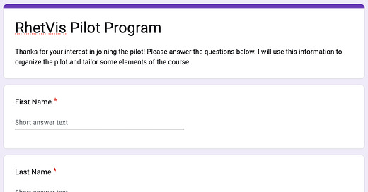
I am going to give you information about the course below. But if you already know that you are interested, you can just go ahead and fill out this short form to express your interest. Note that you are not registering for the course yet by filling out this form. You are only expressing an interest in participating. There are only a limited number of spots available, so if you are interested, fill out the form as soon as possible!
What is the course about?
The course is, above all, about thinking effectively with data visualization. When exposed to new data visualizations, many elements play a role in deciding what messages will be extracted and whether the conclusions one draws from them are valid. The course aims to develop new data reasoning skills for readers and designers. The course revolves around a framework with four main elements:
Data-reality gaps: How the way data has been created has an impact on what can be inferred.
Data transformation: How the way data is transformed has an impact on interpretation, including valid and invalid conclusions.
Visual representation: How the visual representation we choose to use impacts what messages one is likely to extract.
Framing: How the contextual elements of a visualization, such as titles and annotations, influence the way the visualization is processed.
Each one is covered in a specific lesson. The lessons provide mental models to think about how decisions in a given part of the framework affect interpretation and may lead to misinterpretation.
What makes this course unique?
While most courses focus on the technical details of how to map data to visual representations, in this course, we focus more on the “reasoning” aspects of data visualization, covering the elements that lead to good or bad reasoning. By taking this course, you’ll become 1) a more critical and skilled reader and 2) a more mindful and responsible designer of data visualizations.
What does the course provide?
As a pilot participant, you will receive the following from me:
Recorded video lectures
Quizzes, exercises, and reading material
Two weekly meetings of one hour with me and other learners (for two weeks)
Recorded meetings
What will I need from you?
From you, I will need the following:
Study all the material before our meetings take place
Participate in four meetings over two weeks
Give me written and verbal feedback at the end of the course
Is this course for you?
The course requires no specific technical expertise other than basic statistical concepts. If you often deal with data or are just a data-curious person, this course will improve your ability to critically evaluate the messages a visualization conveys and the degree to which you can trust its content. If you are a designer and want to learn to become more mindful of how your design choices impact your readers, this course will give you new tools to anticipate potential misinterpretations.
Join the pilot test program!
If this course may interest you, fill out this short form. Signing up here will put you on the priority list. If you would like more information before joining the list, feel free to add a comment here or reply to this email to send me a private message. I am looking forward to hearing from many of you!


Very interested in this course but I would argue it would be most effective and impactful for intermediate to advanced data visualization professionals. I think only after spending considerable time creating data visualisations for different audiences and experiencing how they interpret visualised data that one can appreciate and actively participate in a course like this. But just my opinion.