Rhetorical Data Vis: Video Lecture on Data Transformation
I just published a new video lecture of my course on YourTube
As you may have noticed from my monthly updates, I have been struggling quite a bit to progress on my online course on Rhetorical Data Visualization. But with the start of summer, I have finally been able to take a few more steps. I am very happy to share with you that the third module of the course is finally out. The module focuses on “data transformation” and its role in the messages a visualization conveys and the inferences one can make. You can find the third module on my YouTube channel:
The course modules are structured around a few steps: data gathering, data transformation, visual representation, and framing. With this third module, I am covering the second step of this pipeline, with a strong focus on how data transformation affects visualization takeaways and their validity.
The module is organized around four main chapters covering fundamental types of transformation and how transformation can lead to misinterpretation.
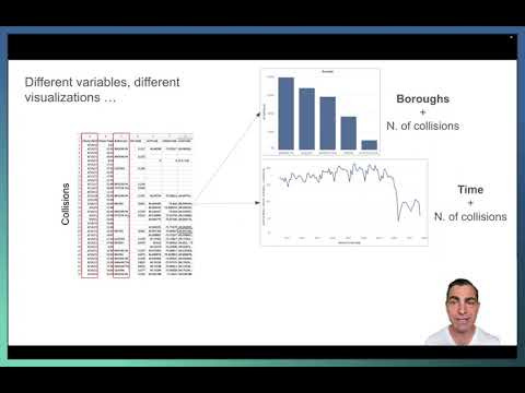
Variable selection and grouping. The most impactful step in constructing a graph is deciding which variables, aggregations, and calculations will be performed to generate it. In this part, I highlight how decisions in this area can significantly impact what is communicated.
In this example from the lecture, I highlight how deciding which variable to show has a dramatic impact on what one can conclude regarding vehicle collisions in different New York boroughs.
Aggregate statistics and derived data. In a very large proportion of cases, visualizations display quantities that derive from statistical calculations over the values of the raw data. Classic examples include the calculation of means, sums, and percentages. In this section, I provide an overview of the main types of statistical aggregations and explain the many ways they can mislead readers if one is not careful when interpreting the information presented by the visualization.
For example, in the slide above I explain how using different statistical aggregations can lead to very different interpretations (even maintaining the set of variables and visual representation) and how the “base rate bias” can originate from the statistical aggregation function one decides to use.
Filtering and range effects. When designing a visualization, one often has to decide what elements to include or remove. These inclusion or exclusion criteria greatly impact the information one can derive from visualization and the inferences one can make. Whether this is done explicitly or implicitly, data visualizations can give a distorted or partial view of reality by representing only some of the possible instances and values of the data-generating process.
In the example above, I show how including or excluding objects to compare trends makes all the difference in generating inferences from the data.
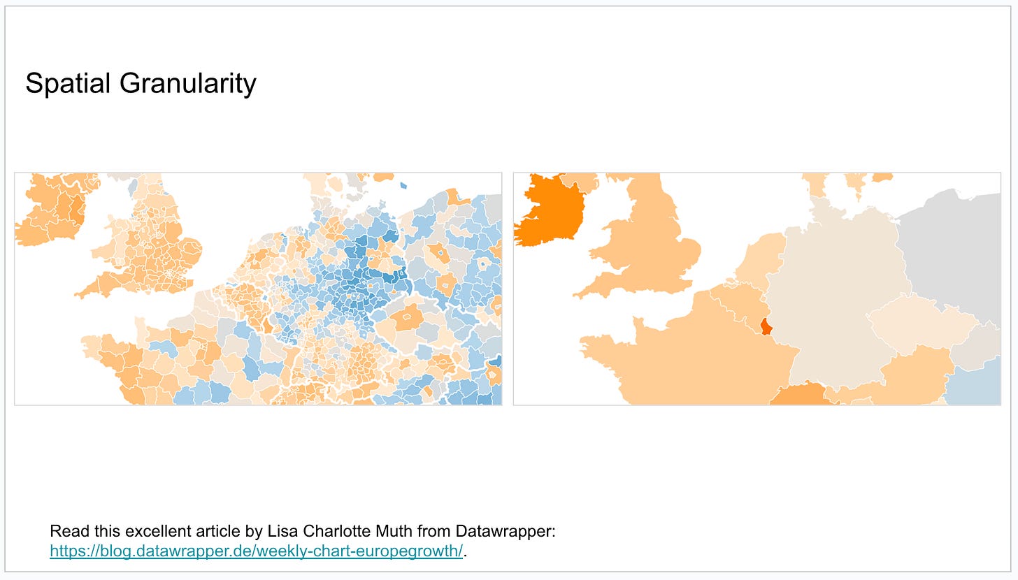
Granularity. Information can often be presented at different levels of granularity. For example, statistics aggregated over time can be presented at the level of hours, days, weeks, and months. Similarly, statistics aggregated over spatial regions can be presented at the level of macro areas and sub-areas, like states and cities. Here again, the choice of which granularity to use can have a big impact on what information is visible and extracted from the reader.
In this example, I show how showing spatial data at different levels of granularity makes different patterns visible.
The ideas I included in this module are highly influenced by the “Data Transformation for Visualization” series I published in the newsletter between October and March. This module, however, focuses more on the impact of data transformation on the rhetorical elements of a visualization, especially emphasizing the ways data transformations can lead to misinterpretation.
I hope you’ll have the time and interest to watch the whole lecture! The video is a bit over one hour and is organized around the chapters I described above. Needless to say, I’d love to get your feedback! Even if you end up skimming it or watching a subsection, it’s useful for me to hear what my readers think. You can comment here or on YouTube, where the videos are posted. I am thrilled to get closer to eventually publishing this as a whole course.
While the scope of the entire course has been shifting a bit in my mind, I am currently planning to develop a total of five modules and then publish it as a course on Teachable. The two remaining modules will be on visual representation and framing. The course will also include quizzes and exercises. I am also planning to develop a “cohort” version where the participants will meet with me and the other learners on a regular basis (probably weekly for a total of five weeks) to review and discuss the material and to do some hands-on work together.
If you are interested in participating (or your organization is interested in a version for a group of employees), please let me know by adding a short comment here. I am looking for people who want to pilot test the course by receiving a huge discount.
That’s all for now. Thanks for reading!


Enrico, I think you uploaded a raw footage version of the video on Youtube with some bloopers at around 46:52 😅 (shit happens!)