
Teaching Data Visualization with AI-Generated Explainers
Initial experiments on using AI to generate mini-apps that help us demonstrate useful concepts in data visualization.

During the break, I have been playing with Claude AI and Gemini to explore their software prototyping capabilities. Everything started because I needed to investigate a particular visualization problem, but as I progressed through my tests, I soon realized I could use the same method to teach my data visualization classes!
Let me take a step back. One of the biggest bottlenecks in teaching visualization is creating material that makes key data visualization concepts apparent. It goes without saying that when one teaches visualization, it is necessary to illustrate ideas through visual examples. The problem is that this need has always been limited by the graphical capabilities of existing tools and the amount of time an instructor could spend on creating new examples. This is why most instructors borrow from one another, use examples they find online and in books, and supplement with visuals created with drawing and charting tools. Creating these visuals has always been slow and tedious. Furthermore, existing tools did not support the easy creation of interactive explainers, which are particularly useful in visualization.
Take teaching color perception, for example. One has to introduce a number of theoretical concepts (trichromacy theory, graphical encoding, etc.), but eventually it’s necessary to show color in action. How do different choices affect color perception? How does proper color selection compare to suboptimal choices? How does a given color map look when used on a map, a line chart, or a scatter plot? These are all questions one can answer by showing the use of color with specific examples.
I suspect this is why tools like Color Brewer become so popular and fundamental in visualization pedagogy.
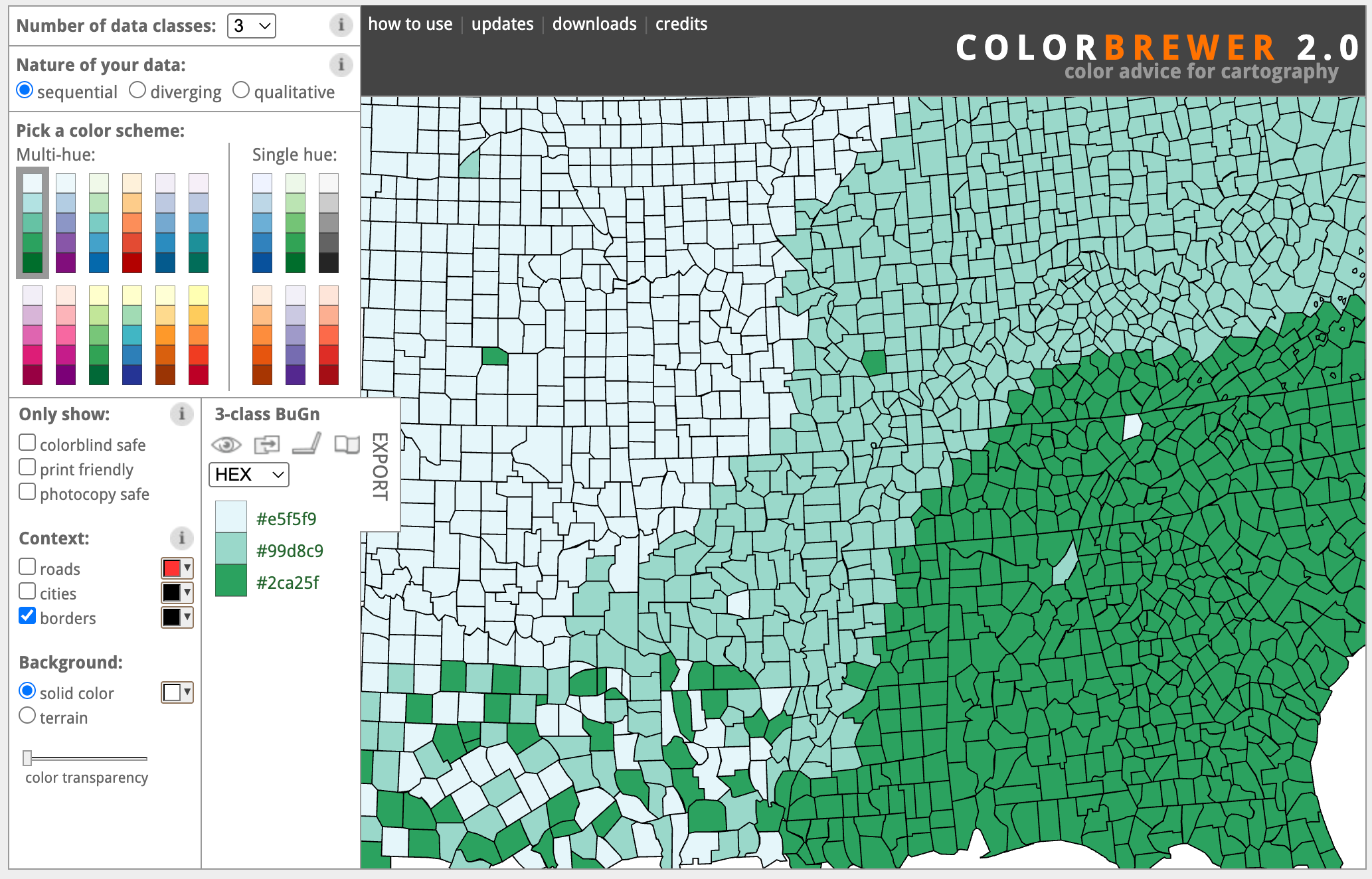
You can select different color maps, change important parameters, and see the results immediately on a fictitious map. But now, building ten Color Brewers is only a few prompts away! Now I can feed Claude with a set of papers, my slides, a book chapter, or just a prompt, and ask it to build an interactive tool that exemplifies the main idea I want to illustrate. The first result is normally not great, but with a few prompts, I can quickly get to an amazing little interactive explainer.
Once you start thinking about what is possible, the opportunities are endless! Let me share an example I built a few days ago: a little app that demonstrates the concept of pre-attentive processing.
Pre-attentive processing is a concept that visualization researchers borrowed from vision science. The basic idea is that there are visual features we can perceive very quickly, anywhere they appear in our visual field, faster than the time it takes for our eyes to move. These features have been extensively studied in experiments in which a human subject is shown an image and has to determine whether a given target exists. Below is a classic example: deciding whether a red dot is present within a set of red dots, when the image is shown for only about 200 ms.
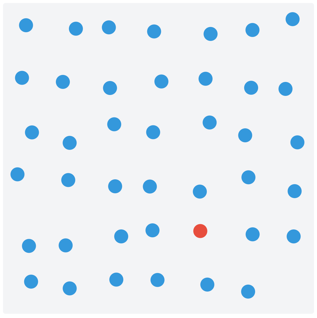
Creating this little app took me very little time (overall, probably between 30 and 50 minutes) and a handful of prompts. Watch this short video to see what the final version of the applications looks like.
Interestingly, I started with a somewhat vague idea, but as soon as I saw the interface, ideas came to mind for how to make it different and better. This is something I noticed with these tools. Since it’s so easy to create an initial idea, it’s way easier to come up with better ideas because iteration is so cheap. It reminds me of exploratory data analysis, where at first you don’t have a good idea of what insights the data can reveal. However, as soon as you start visualizing it, new questions emerge, leading to better ways to visualize the data.
Pre-attentive processing is one example among many others that could be used to build teaching materials for data visualization. Others that come to mind are: color perception, marks and channels, and integral and separable dimensions, but I am sure there are many, many more to explore. Our curiosity is the limit!
In fact, it may now be possible to build an online repository of these explainers for use in courses. The benefit could be immense if there is enough adoption.
After reading this, please give it a try and let me know how it went for you. Are there any specific data visualization concepts that could be taught with a little app built with an LLM? I’d be happy to explore more. Feel free to leave a comment if you want to suggest an explainer or if you develop one yourself!
I couldn't resist! It took me 40 mins to develop the 0-axis explainer that I'm planning to use in my next lectures! https://vpascual.github.io/explainer-zeroaxis/
One dimension that I would add is inclusivity. Effective visualization is inherently subjective - what works perceptually varies widely across the consumers of these visualization efforts. Color vision deficiencies are the obvious example, but not the only one. In reading this post, what hit me here is the opportunity to make subjectivity visible rather than abstract. An interactive explorer that lets the consumers of these visualizations toggle color vision deficiency or background luminance can quickly expose how fragile many good visualization designs actually are, particularly for CAE and CFD data sources. This kind of experience is more powerful than following rigid best practices. This type of direct experience could help to shift effective visualization education away from prescriptive practices toward more empathetic, audience aware design thinking.