Shape the Data, Shape the Thinking #5: Sorting
How sorting makes certain information easier to access
When I conceived this series on data transformation for visualization, initially, I did not include sorting as one of the topics to cover. I reasoned that sorting does not pertain to data transformation but more to how visualization objects are arranged. After some reflection, I realized that I am not sure that sorting pertains only to the visual realm. After all, data must be sorted before being mapped in a given order. So, sorting is part of data transformation, after all! Also, sorting is such a powerful step that I felt it complemented this whole series incredibly well and could not be skipped.
What to sort
The first thing to notice is that sorting is a spatial phenomenon, so anything that is mapped to space and does not have a pre-established fixed order is a candidate for sorting. The most common situation where sorting is available is when one or more categorical attributes are mapped to the axis of a plot. The most basic example is the bar chart, where the x-axis values represent unordered categories, and a more sophisticated but similar case is when we use a cross tab (heat map), where both columns and rows are sortable. The image below shows alphabetical sorting on the left and sorting based on frequencies on the right.

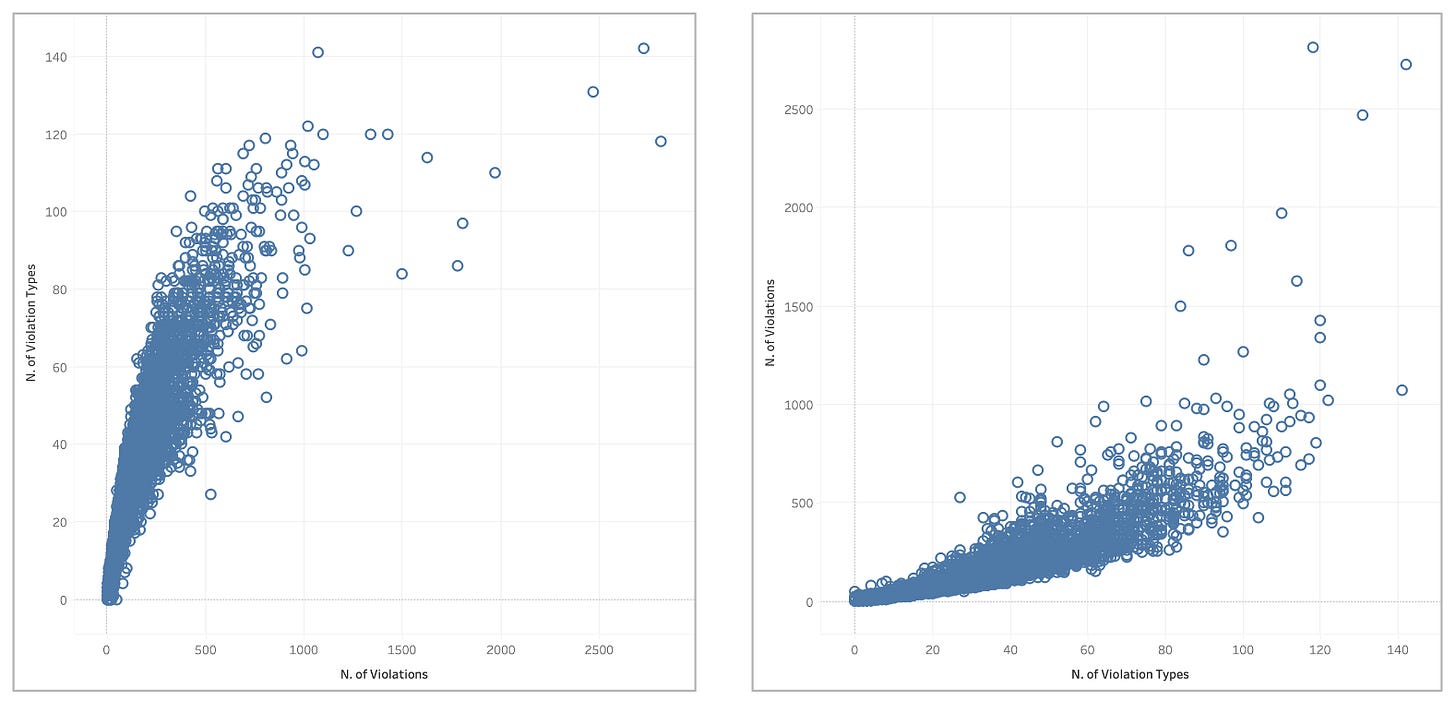
However, choosing the order of categories within an axis is not the only case where we find sorting in visualization. Another more subtle situation is when visualization is made of multiple axes, and the axes themselves can be sorted. Since visualizations with this characteristic are less common, most people are less familiar with this option. Let’s start simple. Even in basic charts like the simple scatter plot, one has to choose which value to map to the x-axis and which to the y-axis.

Both solutions are, in principle, always available, and this choice looks a bit like sorting. A close relative of the scatter plot is the slope graph, and here, too, one can choose the order of the axes if the axes do not have an inherent order.
A more sophisticated graph where this type of sorting becomes even more relevant is the parallel coordinates plot, where each axis represents an attribute of the data set, and each line is a data item in the data set. Each line intersects the axis at corresponding values for each data attribute, forming multidimensional “data shapes” that give a sense of the main trends.

The axes’ order is essential in this plot. If you look at the image above, you can see that sorting can strongly affect the visibility of data patterns.
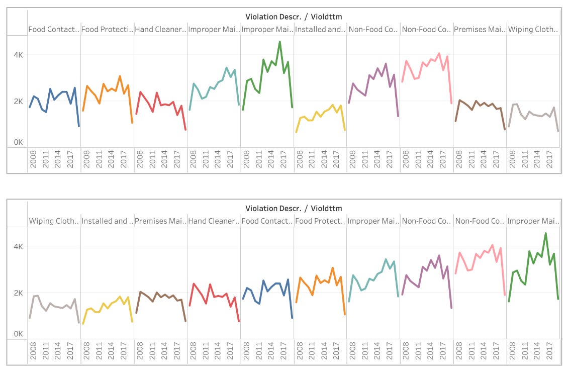
In addition to sorting values within an axis and sorting axes, we have a third case: sorting sets of plots. The most typical situation for this case is when one uses the small multiples technique: the same plot is repeated several times to represent different facets of the same data.

How to sort
When considering how to sort, we must consider two aspects: the spatial arrangement used for sorting and the logic.
Spatial arrangements
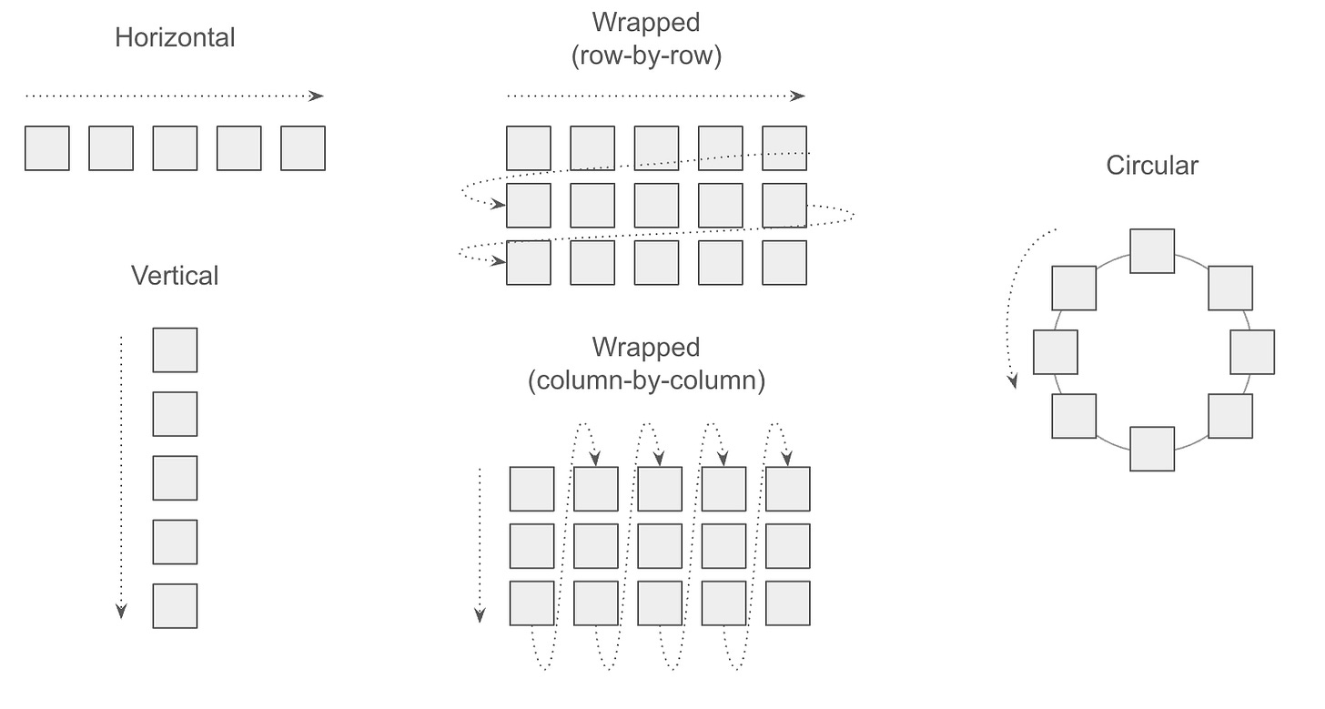
Sorting requires the concept of spatial order, so we first need to clarify spatial arrangements that can be used for sorting. The two most basic ones we always see are horizontal and vertical arrangements. However, visual objects are not always arranged in a vertical or horizontal layout. Sometimes, they are arranged row-by-row or column-by-column, forming a wrapped layout where objects are arranged in a new row or column when the space limit is reached. Objects can also be arranged in circular layouts, where the order can be clockwise or counter-clockwise.
These strategies are by far the most common ones encountered when exploring existing visualization. However, other more creative options exist. Two classic ones are sorting using a circular or, maybe more interestingly, a spiral layout. If the objects mapped to these layouts do not have a predefined order, the designer must decide what a meaningful ordering is. There is a more obscure layout that I was tempted to skip because it’s exotic, but I can’t resist it. Daniel Keim (one of my mentors) proposed layouts in the late 90s based on “space-filling curves:” curves that fill out an area using a strategy that preserves as much as possible distance in 1D when mapped in a 2D area. Consider this a more advanced version of the wrapped layout I mentioned above. Using this layout, we can again decide how to order the objects, provided the axis represents categorical values. The image below depicts a similar technique presented by Martin Wattenberg in which space-filling curves are used to arrange sequential data in a 2D area.

So far, I have described only sorting along one axis according to one value. Still, sorting can also stem from combining multiple axes, like in a matrix arrangement, where rows and columns can be sorted independently. I am sure more complex situations exist, but these cover the vast majority of situations one may be interested in.
Logic
So far, I have covered only the spatial layouts, but the real question is: according to what criteria does one decide how to sort the elements? Before listing a few criteria, I want to emphasize that one of the biggest problems I have observed in this space is that people tend to remain anchored to existing tools' defaults and that the defaults are not that great. I also want to mention that most tools do not provide simple methods to sort according to my list of criteria.
In any case, there are four common criteria for sorting. One can sort by:
Alphabetical order. One of the most common defaults in software applications is sorting by the alphabetical order of the labels representing the categories. This sorting only helps search for a specific label/category if one knows what they are looking for. Otherwise, it does not help perform any specific perceptual task supported by the graphical representation.
Elementary value. When each category is associated with a single numeric value (count, rate, average, etc.), the elements can be sorted by the descending or ascending order of these values. The classic example is a bar chart like the one I presented above.
Aggregate value. Categories are not always associated with one single value. Take, for example, a heat map where the rows represent the categories, the columns represent specific points in time, and the values are quantities associated with a specific category at a specific time. In that case, it’s not clear how to sort the rows of the heat map because there are multiple values for each category, one for each time step. In this case, the categories can be sorted by an aggregate statistic calculated for each row. For example, one could sort by the maximum, minimum, or average of the values found in the row.
Pattern. The last ordering strategy to consider is when you want to order according to specific patterns. Ordering by pattern can happen in two main situations. The first is when one wants to order a whole set of plots. In that case, the plots can be ordered according to a specific pattern. For example, imagine ordering a set of line charts. One way to order them by pattern is to order them according to whether they are increasing, decreasing, flat, or mixed. Second, when two categories are mapped to the rows and columns of a table (matrix) that can be ordered independently, one can sort rows and columns to make certain patterns more apparent. A special class of algorithms exists to find insightful ordering. A good example is the matrix below, where different orderings produce different patterns.

These are the main criteria I know to generate sorted visualizations.
Why sort
Now that we have covered what to sort and how to sort, it’s time to ask the most important question: “Why sort?” And “When is a good idea to sort?”
Sorting is essential in visualization because it makes certain patterns immediately visible and certain tasks much easier to perform. The images I have shown above makes this idea clear, certain type of sorting make some information immediately apparent and easy to access. In a way, it’s like trying to find objects on a messy desk or room and an ordered one.
Unfortunately, I am unaware of any visualization research that looks at sorting more systematically, so I am not well-equipped with scientific evidence about the power of sorting. My intuition is that sorting allows us to group objects and makes it simpler to organize information because we have to attend to fewer visual objects. It’s a chunking mechanism. Other than that, I do not have much more to say about it. I only know that it’s powerful and it works.
I want to conclude with an exhortation to explore different ways to sort data visualization elements. As outlined above, one can sort graphical marks, axes, and whole plots. Unfortunately, many visualization tools use suboptimal defaults like alphabetic order and do not provide powerful means to explore alternative ways of sorting. Visualization designers should always consider if different ways of sorting some graphical components of a visualization could make the information depicted easier to digest.
—
This is the last post of my series on data transformation! I am really excited I am finally done and quite happy with the final result. If you want to get access to the full series, you can find links to every individual post at the bottom of this introductory post:


A great read! Thank you.
One suggestion that I read recently (MacEachren "How Maps Work" Fig 3.30, attributed to Wertheimer) for why some of those sorting examples make patterns more visible is that they allow Gestalt Similarity and Gestalt Proximity to work in concert rather than in opposition. For example, the heatmap (with sorting) places the cells with similar colours closer together in space. Without sorting, the colours suggest a grouping that is inconsistent with the group suggested by spatial proximity. Of course, that is not something inherent to sorting, but it may help to explain why sorting is sometimes effective.