


“Data Moves:” The Power of Transitions Between Charts
How to transition from one chart to another in visual data analysis and presentation.

One of the most neglected aspects of data visualization is that extracting knowledge from data often requires going through a sequence of charts. Interestingly, the sequence problem happens both in data analysis and presentation. When I analyze a new data set, I typically start with a vague idea of what I want and produce an initial chart. The initial chart gives me some hints and a better idea of what I need next, which usually leads to refining the initial chart and data calculations I produced. The same happens when I make a presentation. Often, presentations require you to go through a sequence of charts or different aspects of the same chart. Both data analysis and communication can be characterized as a sequence of charts.
But … What is a good sequence? What is a bad sequence? How do we transition from one chart to another? What options exist for a visualization analyst and designer?
To answer some of these questions, I came up with the idea of “data moves.” Data moves are operations you can apply from an existing chart to transition to another. If we know the possible moves, we have a powerful visualization toolbox. Think about it: if you know how you could transition from one existing chart to another and why, you can create a more mindful set of steps when you analyze and present data.
Data Moves
Data moves are operations one can apply to an existing chart to obtain a subsequent chart. In the following, I’ll introduce the data moves and explain what they achieve and their usefulness. For now, I’ll focus exclusively on changes that originate solely from the data, but I’ll include a description of how changes in the data impact visual representation whenever appropriate.
Segment
One of the most consequential moves for a chart is segmenting the data by adding a new variable. This has deep consequences regarding what one can infer from the results and the necessary graphical transformations a chart needs to accommodate.
Adding a categorical variable helps investigate the dependence of a given trend on an additional factor. This is crucial because it’s one of the few changes that can answer the question, “Why?” Imagine we are investigating a temporal trend like the one below on the right.

This graph shows the average number of people killed in a collision in NYC by the time of day. As you can see, collisions are much deadlier at night than during the day. But why? Can we get any hints from the information in the data? Yes. If we segment this line chart according to the top contributing factors, we obtain the graph on the right.
Once we segment the data according to a meaningful variable, we have a much better understanding of what is happening. The trend in the first chart is driven by unsafe speed and disregarded traffic control. Segmentation gives us additional hints about what drives these deadly collisions.
Add space or time
Something similar happens when adding a temporal or spatial variable. When we visualize some data aggregates, it’s often useful to see how they are distributed temporally or spatially. By doing that, we can answer the questions, “Does it depend on time?” and “Does it happen the same everywhere?”
The chart below on the left compares the boroughs according to how many people have been killed in total over the years.

But how has this breakdown changed over time?
As you can see, it’s quite uneven. Surprisingly, unsafe speed started only in 2015, probably because it was not recorded in previous years and it was recorded with a different label. Similarly, let’s look at how the combination of contributing factors is distributed geographically in NYC.
Here again, we have some potentially interesting patterns. Some areas tend to have a different combination of factors than other areas. Interesting, right?
Change or add measure(s)
Adding or changing a quantitative variable is a slightly different move. Additional quantities do not break down data into subsets to compare. Rather, they provide an additional perspective. Take, for example, this simple chart on the left comparing the number of collisions by borough.

Looking at this chat, we can develop a few conjectures and conclusions. We know, for example, the total number of collisions happening, but we can’t directly infer that one borough is “worse” than another because the number of collisions is correlated with traffic volume. So, if we want a more complete picture, we can take a look at the average number of people injured or killed in a collision in each borough (chart on the right).
Both charts are useful, and together they tell a more complete story. It’s not hard to imagine how switching from one measure to another can help both when analyzing and presenting data.
Most quantities we visualize come from specific calculations we perform on the original values. For example, we often produce aggregate statistics such as count, sum, average, min, and max. When we explore and present data, changing calculations to provide complementary information is helpful. One classic example is switching from absolute to relative measurements or pairing averages with frequencies to assess their robustness.
Filter, Zoom, or Highlight
Filtering helps focus on a subset of interest. We often start with an overview, notice something, and add a filter to single out a pattern more precisely. The classic Ben Shneiderman’s information seeking mantra comes to mind here, “Overview First, Zoom and Filter, Details on Demand.”
The second chart I presented above, with the average number of people killed in a collision by the hour of the data, is a good example. Originally, I just looked at the whole set of causes (image on the left). Then, I filtered them by 1) removing the “unspecified category” (the grey line in the chart below) and 2) keeping only the top 5 in terms of the number of collisions. Another step we could add at the presentation stage is to highlight the lines that correspond to the main facts we want to convey (chart on the right).

Filtering is intimately related to zooming and highlighting. They often are simply different ways to visually instantiate the same concept: focus on a subset of items. The only thing that changes is how to focus: removing elements, highlighting some elements, and zooming into these elements.
In reality, filtering is more complex than that. Some filtering operations do not remove elements but change their meaning. The bar chart below on the right is the same as the one I presented above (reproduced here on the left), except I applied a filter to focus exclusively on collisions involving substance abuse. Do you see how the values change?

When we do that, we must be careful to make it explicit that the presented data corresponds to a specific set of filters. Furthermore, it is important to avoid the trap of ascribing an observed trend to the specific filter one used. For example, in the chart above, we can conclude that the Bronx has a bigger problem with substance abuse than other boroughs only if this pattern shows up exclusively when applying this specific filter and not in the whole data set.
Change granularity
Sometimes, a visualization uses data properties with a hierarchical structure. Time and space are inherently hierarchical. Categories can be grouped and ungrouped, and quantities can be binned with different levels of granularity. Because of this, it is always possible to move from one visualization with a given level of granularity to another.

Changing granularity often goes well with zooming. As one zooms into an area, the area itself can display information at a higher granularity. This is what happens in many interactive maps online. For example, did you ever notice in Google Maps that when you zoom into an area, more details become apparent?

The map on the right does not just enlarge the object you see on the left; it also adds more details that are not present in the zoomed-out version. This is called “semantic zoom,” and it’s a very well-known visualization technique that’s been studied widely.
Reorder
The last step to cover is reordering. In visualization, we can often reorder the data items in different ways, which can uncover different patterns or prioritize certain elements.
In the image below, I changed the measure associated with the main categories of contributing factors. The one on the left represents the average number of people injured, and the one on the right represents the total number of collisions.
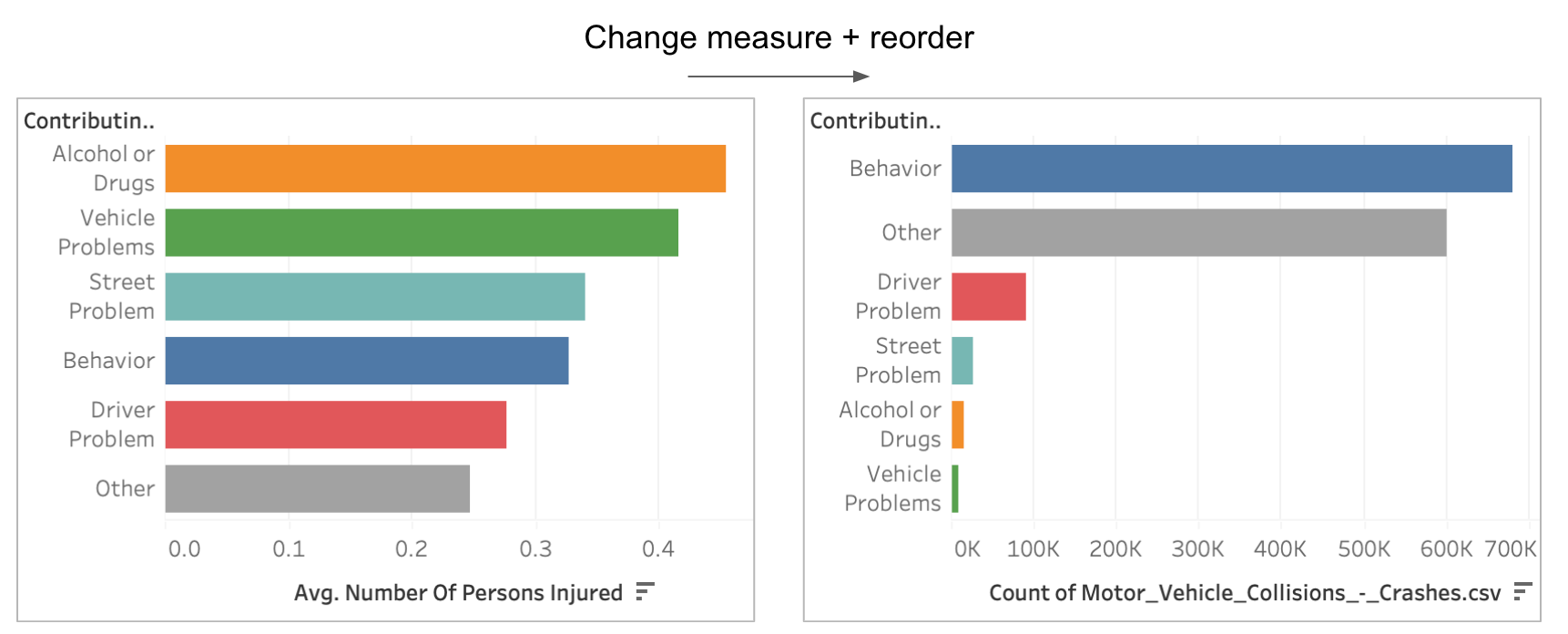
As you can see, when we change the measure and reorder the bars, we provide two alternative ranking criteria that reveal completely different patterns.
Conclusion
Being able to move from one chart to another is a master skill. You need it first when analyzing a data set to dig deeper into some questions and then in presentation to create a coherent sequence of charts.
By learning these moves, you can more directly contemplate what to do next when producing a first chart and consider changes more systematically.
In this post, I focused exclusively on data moves that stem from changing the variables that are mapped to a visualization or the way they are transformed. For these cases, changes to visual representation are a consequence of these changes. Changes can also stem from the way the same data is represented visually, but I decided not to cover them in this post.
These data moves do not exhaust all the possible transitions, but it’s a very good start. I hope you’ll find them insightful and useful. Let me know what you think!
I think you're absolutely tight to identify the process of going through a sequence of charts as "one of the most neglected aspects of data visualization". One of my anxieties about the way data analysts in my field (healthcare performance management) go about their work is that they just don't realise they need to be doing that. All too often, they consider their end-product as a single table or chart. It's as if they think they can communicate complex arguments by uttering just single, isolated words. We need sentences. No, paragraphs! No, chapters!
Thanks for sharing this. Really agree with the idea of sequences when analysing and presenting. Liked how you used only one dataset to explain the different moves. It adds a touch of continuity.