Last week I introduced mini-projects as one pillar of my graduate visualization course. A interesting outgrow of that activity is a set if data visualization clarity and aesthetics guidelines we developed over time while reviewing the solutions our students submitted for these exercises.
For a long time I have felt that I was supposed to teach my students how to make their visualization more clear and “clean” but I was stuck by not having a clear sense of how to talk about these topics in a way that would not be very hand-wavy.
I wished I could come up with some amazing set of principles, but in the end we just reached a compromise. We built an initial set of guidelines that are based on two elements. First, they come from observing actual problems we found over and over again in the solutions submitted to the mini-projects. In this sense the guidelines just emerged from practice. Second, they come from trying to justify our intuitions on notions of visual perception. In this sense the guidelines also rest on considerations stemming from visual perception. In this post I am going to focus on the guidelines. This will be followed by another post more focused on visual perception. We have a total of three categories: clutter, unbalanced colors, sizing & spacing.
Important note before I move on: the examples below come from a notebook my PhD student Daniel Kerrigan created for our class. He has not only contributed by coding these examples but also with recommendations and discussions. So, what I am presenting here is really the result of our collaboration and a large chunk of the merit goes to him (whereas any mistake or inaccuracies go definitely on me).
Clutter
Clutter is one of those things that are hard to define but you can name it when you see it. There are three main sources of clutter we see over on over again.
Heavy gridlines
Many visualizations use heavy gridlines in place of subtle ones. The scatter plot below gives a clear example. What is the problem with these gridlines? They are not just aesthetically unappealing but they also divert attention from the actual data one is interested in. The grid “screams” look at me, look at me! When a heavy grid is replaced by more soothing thin grey lines the lines recede in the back and help placing data in context without being intrusive.
Heavy borders
The problem of heavy borders is similar to gridlines, they attract attention where it’s not necessary. They just show up in a different way. In visualization it’s always possible (and often necessary) to add borders to graphical elements, but the borders need to be subtle, not heavy. The classic example is choropleth maps like the one below, but there are many other possible cases: borders around circles in scatter plots, borders around bars, borders in tables (matrices). It’s pretty much everywhere.
Heavy labels
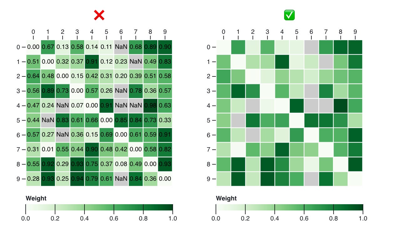
Sometime students are tempted to add numeric labels everywhere. Like in the example below. I am not sure why. I guess it’s the anxiety of actually being able to see the numbers. I can’t say there’s never a need to do something like that (even if it can be designed in a way to be less cluttering) but in general it’s not a good idea. Visualization is almost never about precision. For precision you can create carefully designed tables and find a way to link tables to visuals if you need it.
Unbalanced Colors
Unbalanced use of color is another classic problem. Now, honestly honestly problems with color use are much more extensive than those I mention here. This is worth a whole separate post, if not a whole series. Here I focus on two very common problems we observe with color: contrast with background and balance. Very often we find that students choose colors that do not have enough contrast with the background. This is a typical example of what we see.
A similar one is a choice of colors that makes one of the colors stand out compared to the others. While there are situations where this is desirable, that is, when one wants to highlight a specific category of objects, it’s highly undesirable when it’s just the effect of a poor choice of colors.
The basic rule is the following: choose colors that have similar luminance and saturation. Even better: just use the color palettes in Color Brewer unless you have a really good reason for not using them. Thanks to Cynthia Brewer and her collaborators we have a super balances and scientifically validated set of colors. Why go through the trouble of creating your own? Of course there are cases where you might want to create your own but CB is a really good default.
Spacing and Sizing
The last class of common problems is about how charts are sized and how space between the elements is used.
Size
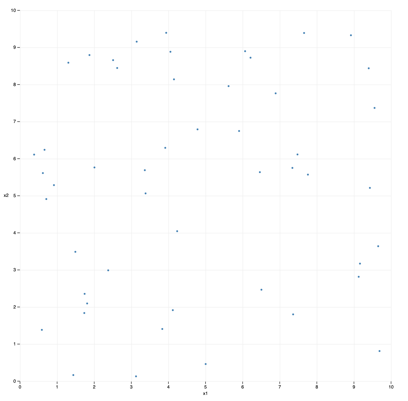
A super common issue I experience with students: they make their charts really big. Why? I am not sure. My guess is that their intuition is that the bigger the chart the more you will be able to see. That is, bigger is better. But unfortunately this is not the case. Actually in many cases smaller is much better. There are a number of reasons why this is true but basically the main idea is that with smaller representations our eyes have to span a smaller area. The example below gives a good sense of the effect. Try to compare the two scatter plots, the big one and the small one below it.
In the bigger plot there is way too much sparsity to see the patterns in the data. What I always tell our students is: don’t be afraid to make your graphs smaller. And also to just test different sizes to see how they look like. Testing is always good.
Proportions
This is a classic of data visualization: if you change the proportions of a graph in terms of width and height you can make certain patterns more or less visible. The first time I’ve learned about this problem is, I believe, from William Cleveland’s books and his idea of “banking to 45 degrees”. The basic idea is specific to line charts and is about using a proportion that makes the segments of the line chart have an average slope as close as possible to 45 degrees. The idea is that the human eye is particularly sensitive to that type of angle and as such banking to 45 potentially makes the largest number of visible patterns as possible (follow-up work exists refining this idea further).
But the problem of proportions is by no means specific to line charts. What proportions should a scatter plot have? In my view, it should be a square unless you have a good reason for not making it a square, otherwise you will end up privileging one axis over the other. How about bar charts? It depends: you make them too wide and they are sparse. You make them too narrow and the are crammed.
In general I find that the way you set the proportions suggests the reading direction the viewer should (and probably) will follow. Wide charts suggest an horizontal direction of reading. Narrow charts suggest a vertical direction. And squares do not suggest anything in particular.
Spacing
The way you space objects has a huge influence on how people will read a given chart. Objects that are closer together tend to be perceived as a group (see the Gestalt laws of grouping). The best example for this effect is when tabular visualizations are used.
The way cells are spaced has an effect on reading direction. More space between the columns and you see vertical lines. More space between the rows and you see vertical lines. The solution is once again to be mindful of the problem. There is no one single solution, but knowing that this effect exists goes a long way towards avoiding a mismatch between what one wants to communicate and what the visualization suggests.
Conclusion
This is by no means an exhaustive list but it does cover a good number of common issues we observe in students starting with data visualization. It’s easy to remember: clutter, color, sizing & spacing. I hope it also helps going beyond the specific examples I have shown above.
Originally, I wrote a longer post with a second part on visual perception and how these effects can be described under its lens. But I eventually decided to split it in two. So this one here is the first part and soon I will be publishing a second part (and maybe more).
As usual, let me know what you think. Did I miss anything relevant? Should I add or change anything?


Hello, thanks for this work on a list. As a cartography teacher, I encourage my students to change the defaults parameters of the representation to subdue the grids, borders and other secondary information, too often using 100% black fine lines. Also, I'm sensible to the colors harmony, some colors are too harsh or too often seen in the same palettes, a bit of creativity is encouraged.
Great post. I'm curious, what's your position on clarity vs. aesthetics with line charts? Specifically, I'm wondering about straight lines vs. curved lines. I'd love to see some do's and don'ts around that can of worms.