


Can LLMs Detect Reasoning Errors with Charts?
Yes and no.

If you have been reading this newsletter for a while, you know that I have been playing with the latest AI tools to see what they can and cannot do with data visualization. In this post, I want to analyze AI capabilities from a new angle, the angle of reasoning with charts. One of the main ideas I have been pursuing in the last couple of years is how to evaluate data visualization from a perspective of truthfulness, that is, how do we know that a message sent with a graph is valid? This is the main impetus behind my Rhetorical Data Visualization course and my ongoing intellectual endeavor.
So, one natural question I started asking a few days ago is, “How good are LLMs at detecting potential reasoning errors with charts?” In other words, how good are they at detecting misleading messages?
Here is an initial exploration of this idea. To explore this idea, I am using ChatGPT-4o with examples I have developed for my Rhetorical Data Visualization course. In doing that, I am using prompts that do not give too many indications to the LLM that I am testing the validity of the charts. In other words, I am not asking the LLM to tell me whether a chart is misleading or not, but I am using the trick of asking what it “thinks” of the titles I designed for the chart I submitted for evaluation.
Let’s see what we get!
Data-Reality Gaps with Earthquakes
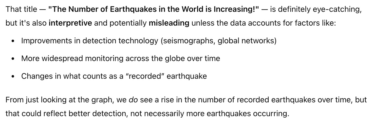
The first test uses a chart I borrowed from Ben Jones’ book Avoiding Data Pifalls. The chart depicts the number of earthquakes with magnitudes larger than six detected between 1900 and 2013.

A cursory reading of this chart may lead someone to erroneously infer that the number of earthquakes has increased. Still, the reality is that only our ability to detect them at the lower end of the scale has increased over time, not their frequency.
To test this idea, I uploaded an image of this chart (with the text in the top left area removed to avoid giving hints) and submitted this prompt:
This graph shows the number of earthquakes recorded between 1900 and 2013. I'd like to add a title that states, "The Number of Earthquakes in the World is Increasing!" What do you think?
And here is the response:
Pretty good as a first try. From the response, I can see that ChatGPT is using some memory of information it has gathered from me in the past, but for now, I’ll ignore that.
Maps and Base Rate Bias
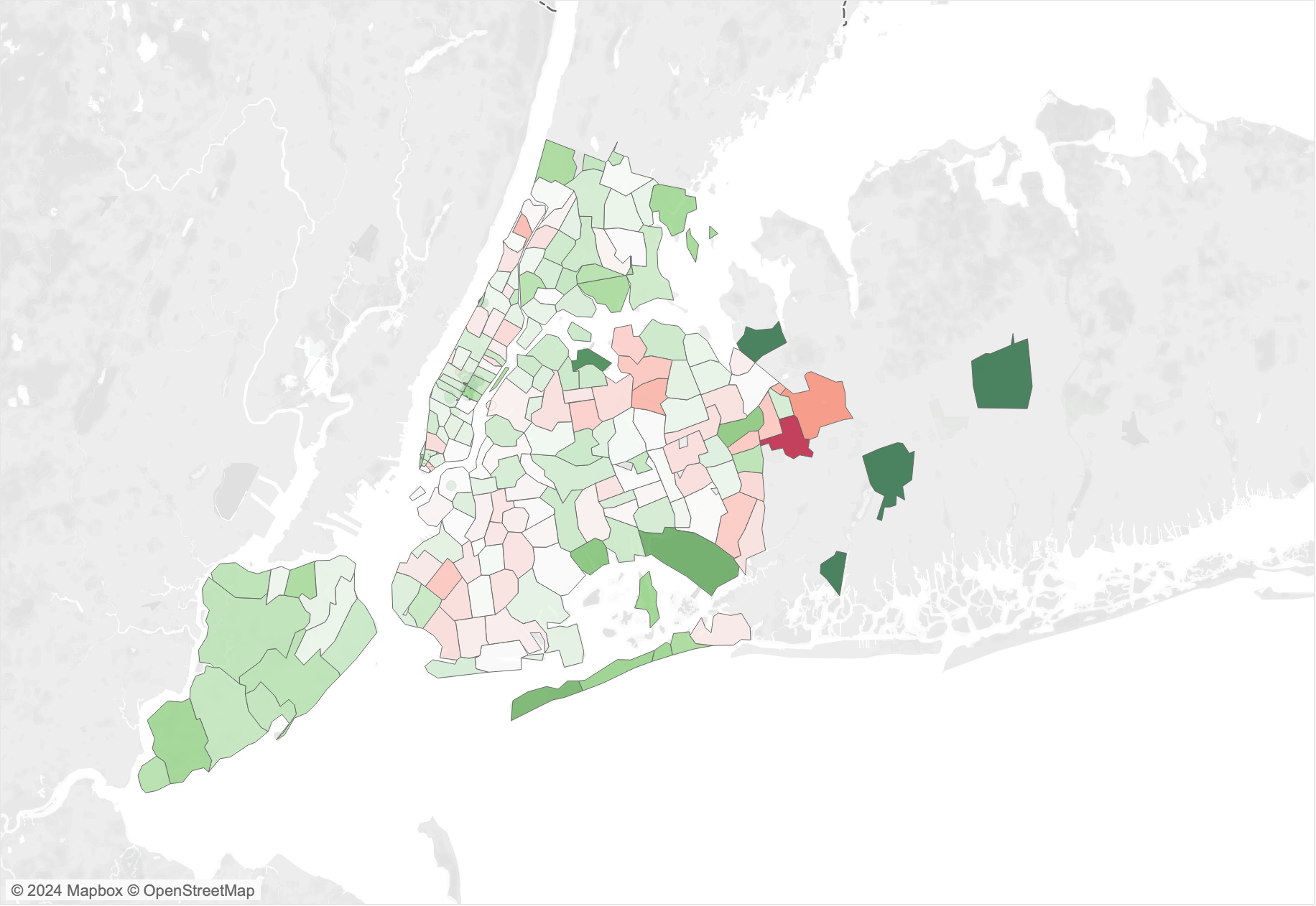
The second example is one of my favorites. When we have a map with additive statistics, that is, one that depends on the number of objects/samples within each region, the results are often confounded by the population density.
I use the map below (and other variants) to show this effect. This map depicts the number of collisions in New York City. Each region is a zip code area, and they are colored by the total count of collisions. Looking at this map, you may be tempted to infer something about how “dangerous” each specific area is. However, the number of collisions depends on how many cars circulate in the area, so a high value in a region does not necessarily mean that that area is more dangerous than others; it’s just an area with a high car density.

To test the LLM’s ability to detect this problem, I used the same strategy as above. I pretended to be looking for help in designing a title. This is what I asked.
This map shows the number of collisions in NYC zip code areas. I want to add a title to this map that states, "Here Are the Most Dangerous Areas of NYC." What do you think?
And here is the response:
Pretty good again. Not bad at all. It catched the problem with the number of collisions and the population density.
COVID-19 Cases Vs. Infections
This is another favorite of mine, which is somewhat similar to the previous example. Here is a classic chart from the covid-19 era, a chart of cases over time (this one coming from one of my favorite sources, the Financial Times). I am sure you are all familiar with it.

One common problem and misinterpretation of these covid era charts is that the curves represent the number of people infected. In fact, we probably have spent the whole pandemic equating cases to infections. The problem with this interpretation is that the number of cases depends on the number of tests performed, so when we look at these trends, we can’t be sure what the trend of infections is because the background sample also changes over time (another case of base-rate bias).
To test this reasoning error, I submitted this image with the following prompt to ChatGPT:
This graph shows covid19 cases over time. I want to add a title that states, "Record of Number of People Infected Between January and September." What do you think?
And here is the response:

From this response, I could not decide if it detected the problem or not. It only mentions that the chart depicts cases, not infections, but I did not see any evidence that it had detected the real problem. To test this further, I added the following instruction:
I want to emphasize that more people were infected during that period.
And this is the response:

Gotcha! I think this demonstrates that it had not detected the problem correctly. In fact, once I asked, it proposed titles that would be clearly misleading, inferring infections from cases.
Maps with Sensitivity to Sample Size
The last example I tried is again with a map, but this time to test the misleading effect of “sensitivity to sample size.” The map below shows the mean inspection scores of restaurant inspections in zip code areas of NYC. The problem here stems once again from the problem that each area has a different number of samples (restaurants). Areas with a higher number of restaurants are expected to converge closer to the mean value of the whole data set. In contrast, areas with few restaurants are more likely to generate extreme cases. The reason behind that is simple. If there are only a few restaurants in an area, it is sufficient to have only a few restaurants with a high or low score to have a strong effect on the mean.
Following the same logic of the other examples, I asked ChatGPT:
This map shows the average score of inspections in NYC zip codes. I'd like to add a title, "Where not to eat, check the red dark areas!" What do you think?
And this is the response:

So, at first glance, it does not seem concerned at all with my proposed interpretation. To be sure, I asked a follow-up question:
Do you think my interpretation is correct? The dark red areas are where the worst restaurants are.

Again, it does not seem to be aware of the problem, so I dug even deeper:
I think that each zip code may have a different number of restaurants though. Do you see a problem with that?
And this is when it finally realized there was a problem:

In the end, I would consider this one a fail.
—
What do you think? Have you tried anything similar? Overall, ChatGPT was able to detect two problems out of four. In a future post I’d like to try other examples to see what happens. Stay tuned!
This is great! Now I'm curious what could be the responses from other LLM's like copilot, gemini or deepseek 🤔?
Interesting. I wonder if 'educating' the LLM first through a persona might help here. For example you could prime it to consider a number of categories of interpretation error:
"You are an informed analyst capable of critical thinking and aware of common problems in map and chart interpretation. This includes, but is not limited to, 'regression to the mean', 'epistemic error', 'absolute numbers vs rates', 'the ecological fallacy', 'the modifiable areal unit problem (MAUP)', 'saliency bias' etc. You should also be aware of other common forms of bias in interpretation including those around data sources and who created the chart/map being evaluated."
It would be interesting after specifying such a persona, whether you get similar results with your examples.
Jo Wood